A family-owned, custom home and remodeling company refreshes their brand.
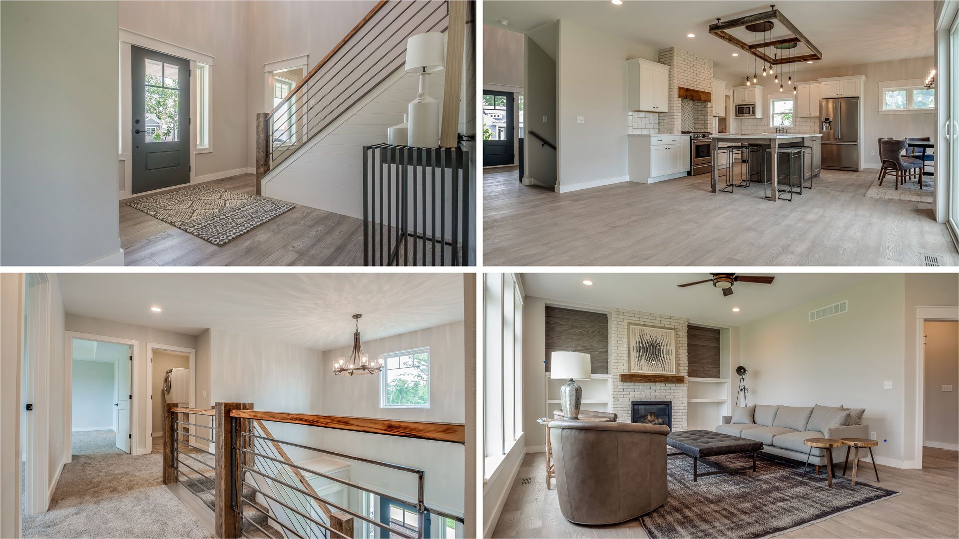
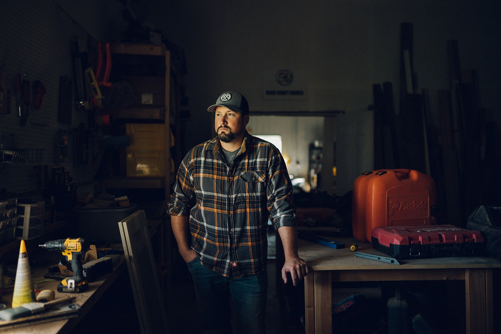
Jerad and Mollie Kilburg founded High Craft in 2009 and are both licensed REALTORS®. They bring a real estate eye to everything they do and are award-winning in designing and building custom homes, remodeling bathrooms, kitchens, roofing and siding.
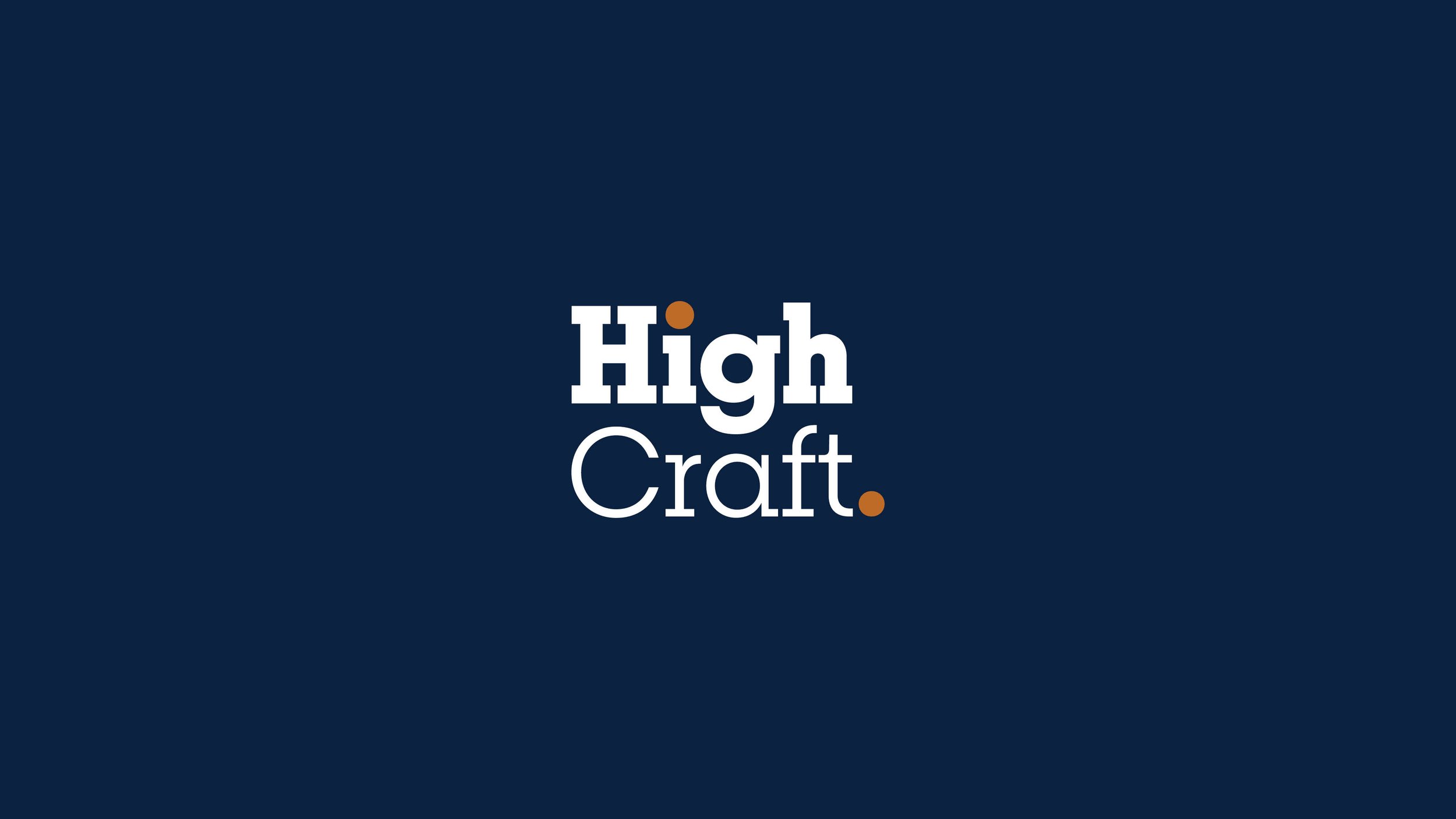
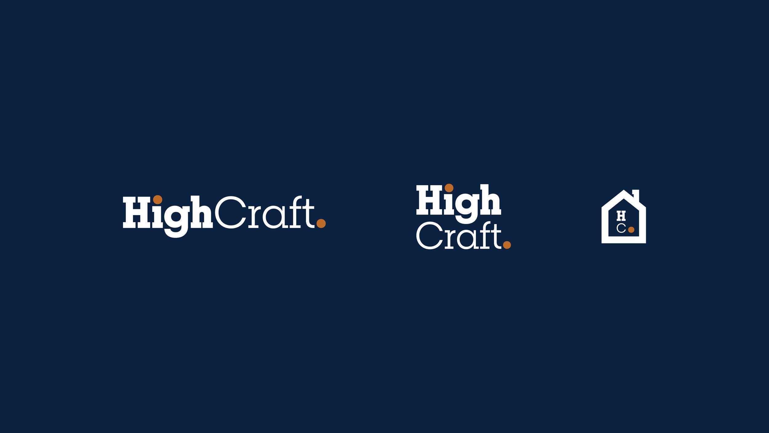
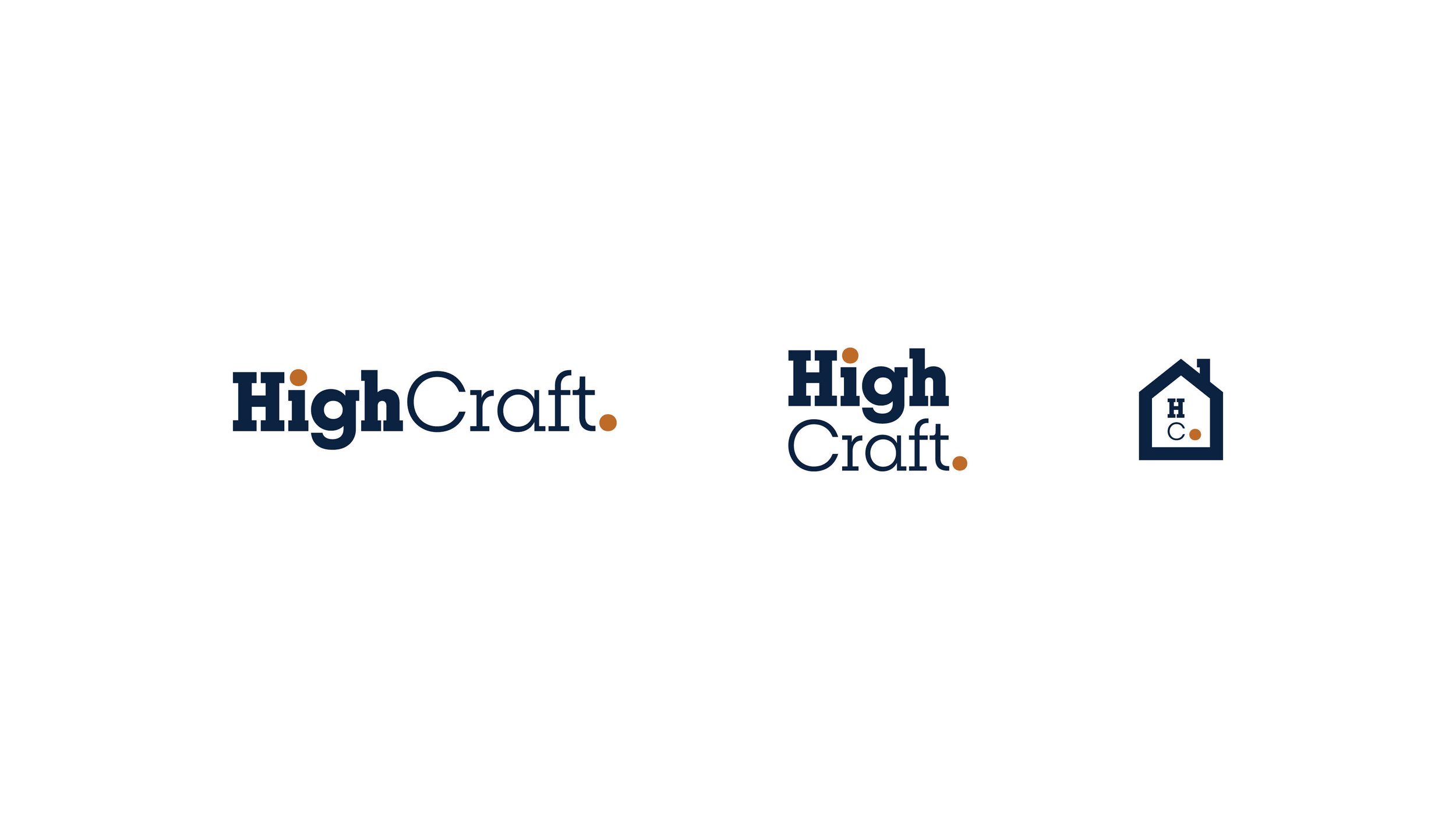
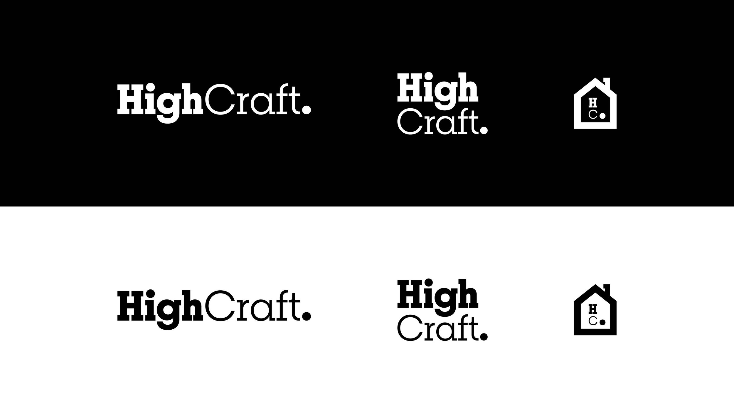
For a decade, Jerad and Mollie operated without a defined color palette, fonts, or logo. Their previous logo, lacking the high-end touch they deliver, did not reflect the quality they strive for. Their aim was to create a new identity that embodies high-quality, accessible luxury, and simplicity, supported by a reliable team. The new logo symbolizes the intersection of accessible luxury and durability, a stark contrast to their previous one.
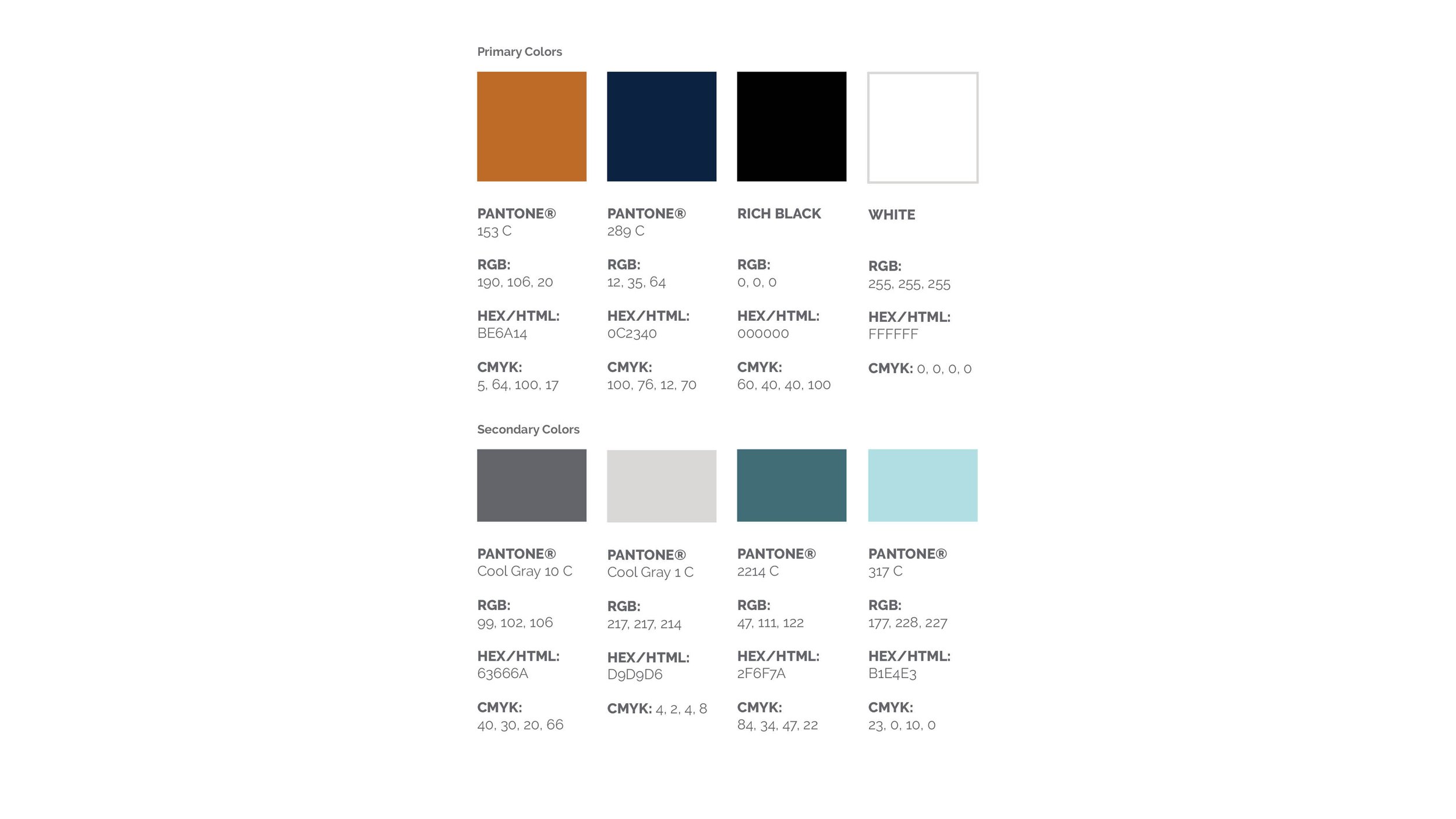
The new identity introduces a rich, deep navy and slate orange. Breton is a geometric slab serif typeface inspired by Boston. Breton's most noticeable characteristics are the rounded characters (like "o," "c," or "e"). This not only gives a nod to construction but also a not-out-of-reach luxury for the value-minded audience they seek.
As the art director of the photoshoot, I played a pivotal role in shaping the brand identity and the visual elements of the High Craft website and social media, bringing the new brand identity to life.
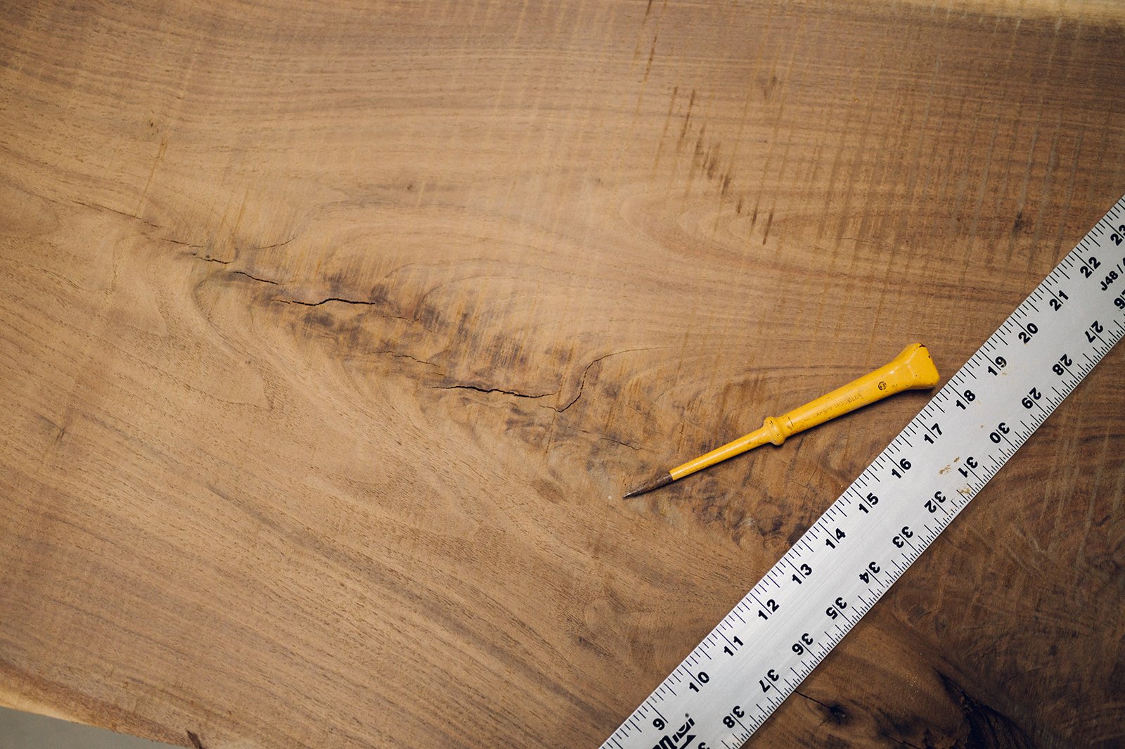
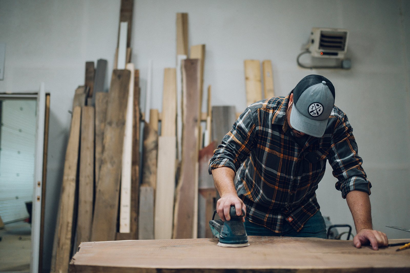
Work done as lead designer at Meld Marketing. Photography by DJ Freesmeier.