Replanting a brand identity focused on providing fresh food to families throughout Eastern Iowa
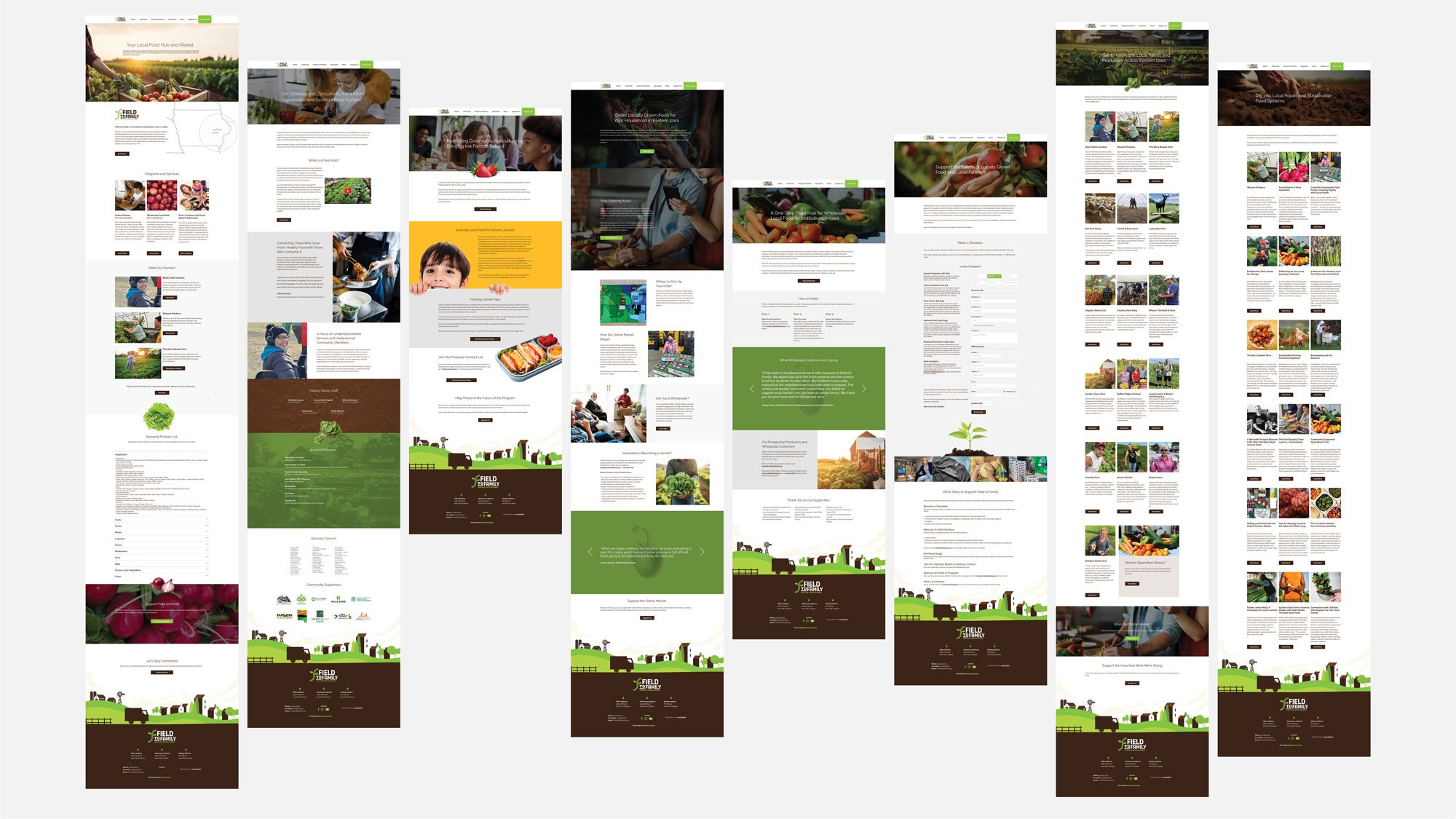
A mission to deliver fresh food to families across Eastern Iowa, education programs, and offering a local online farmers market are three main goals of Field to Family. Communicating that in a brand identity is where listening to a client's goals, aspirations, and pain points is one of the most rewarding experiences as a designer.
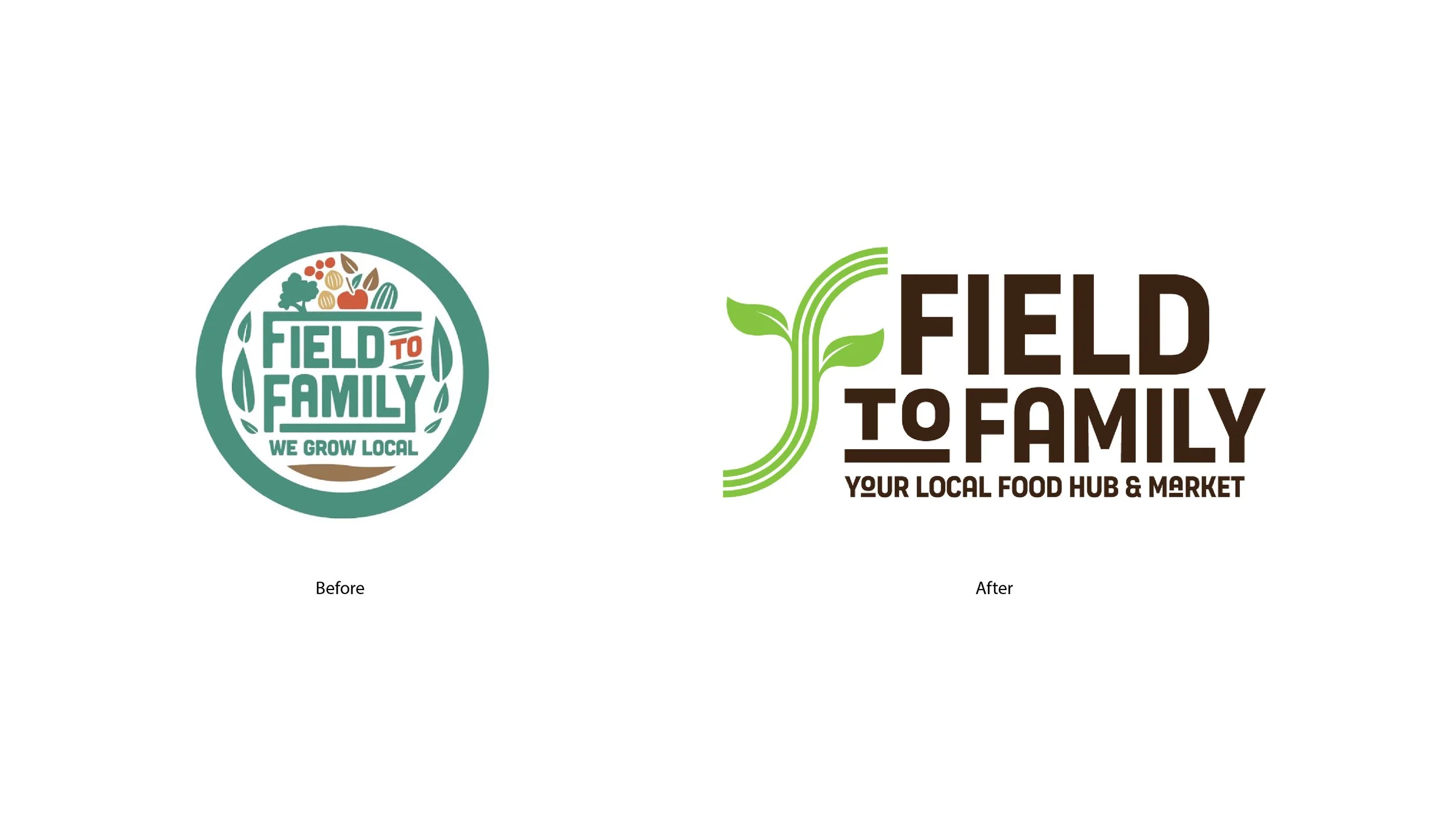
While the old logo spoke to fresh food and produce, it was not mobile-responsive and was difficult to execute across social media, vehicle wraps, and the website. The colors did not speak to fresh vegetables and fruits or the fields of the hard-working hands that play a pivotal role in bringing the field to local families.
The new identity echoes the old logo by retaining the leaves. It now incorporates a more visible icon that speaks to the fields, intentionally showing three rows that match business goals, the road and path to delivering the food to your table, and a simpler brown and green becoming the brand's primary colors.
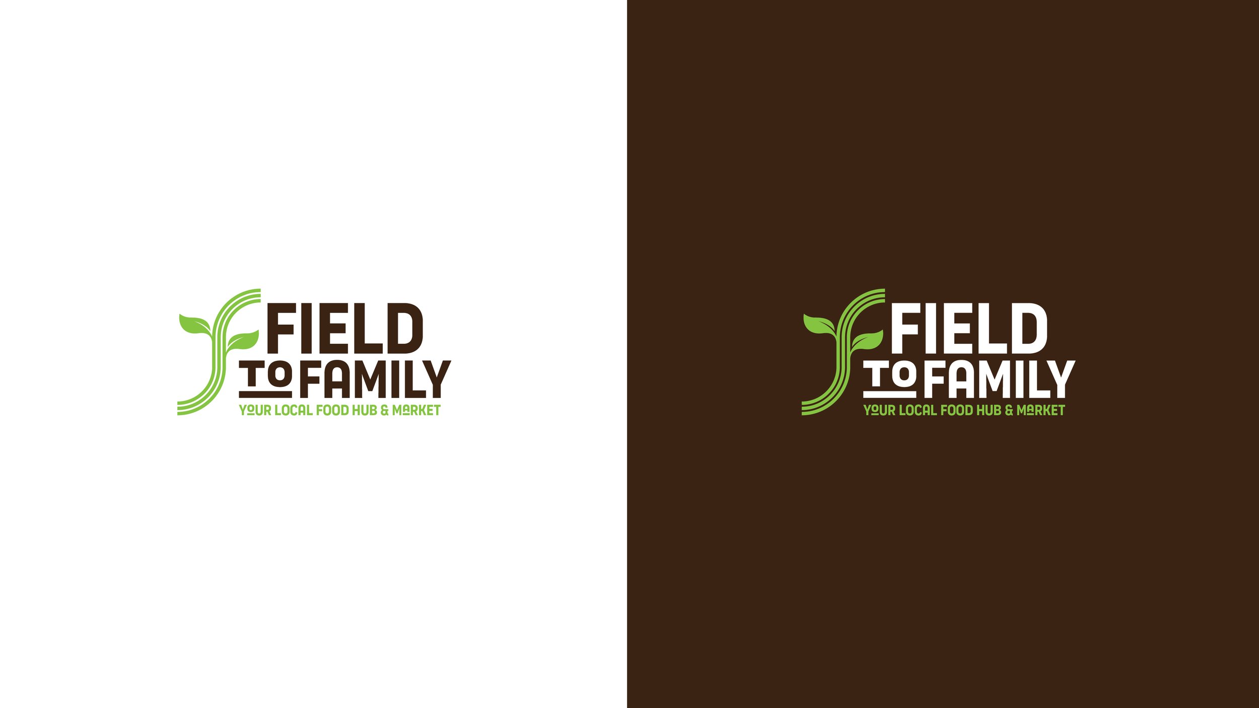
The fresh green and brown color palette was inspired by the life cycle of produce, from freshly picked to decomposition. The secondary color palette introduces orange, purple, and red, which capture many fruits and veggies we all love: strawberries, apples, grapes, eggplant, cabbage, oranges, carrots, peppers, and more.
After the presentation, the founder and CEO said, "I feel seen." Simplifying the brand identity can communicate the organization and the mission behind Field to Family. Design can solve that by listening and eliminating the unnecessary so only the necessary can speak.
Work done as lead designer at Meld Marketing.