A rebrand that established Geonetric as a digital agency in healthcare.
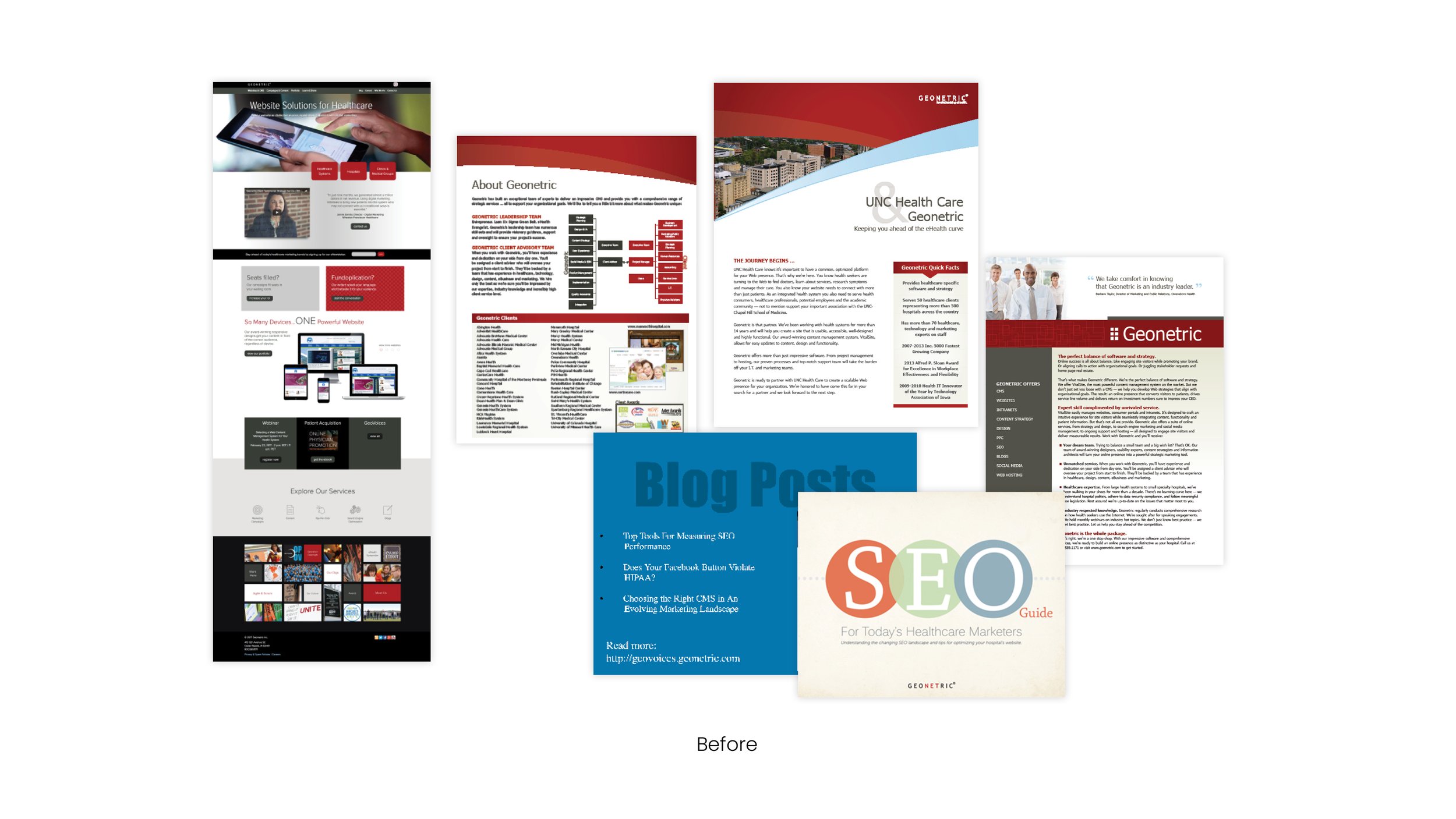
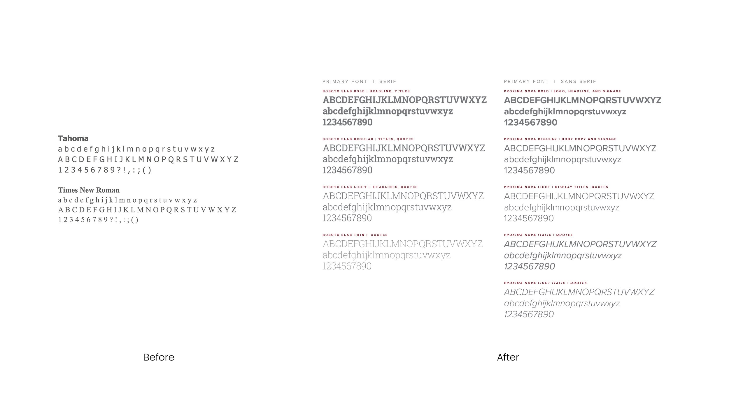
I built trust by mentoring and coaching the marketing team and C-Suite on design principles, resulting in a systematic rebrand backed by research. This effort helped position Geonetric as a digital agency in the healthcare industry by revamping the company website, digital and social media presence, print materials, trade show booth, and company logo. Geonetric's website received a Platinum MarCom Award in 2017.
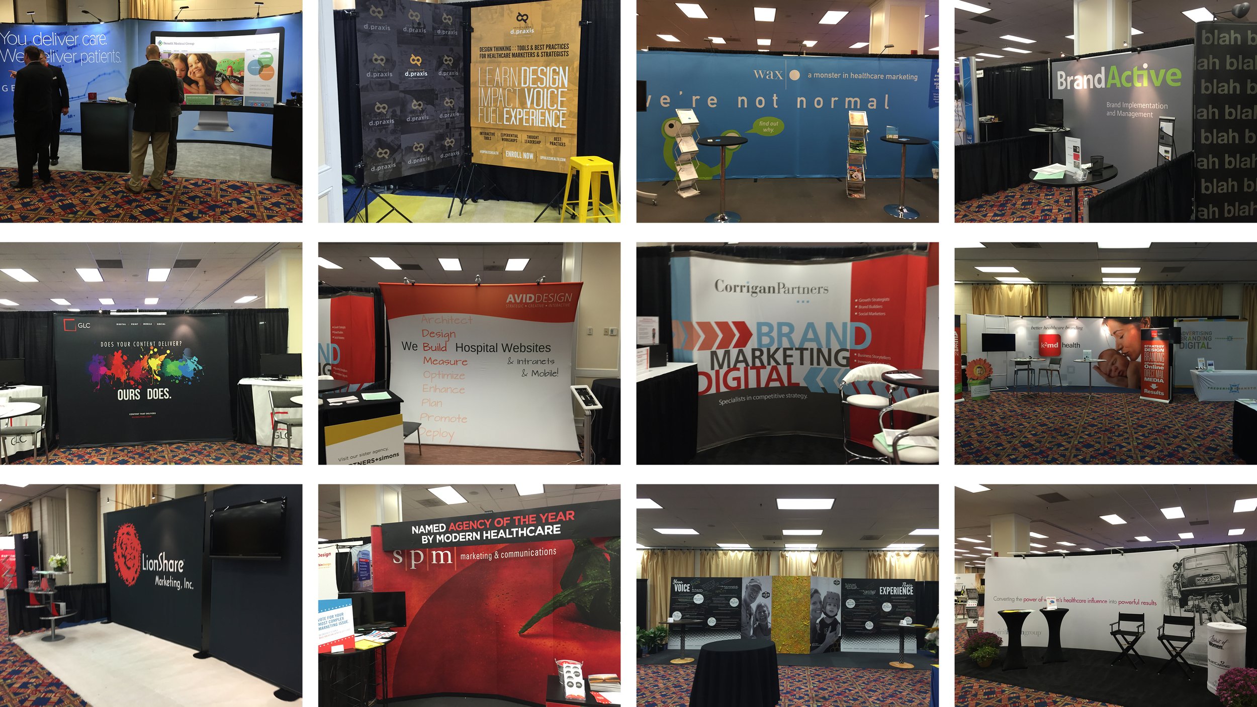
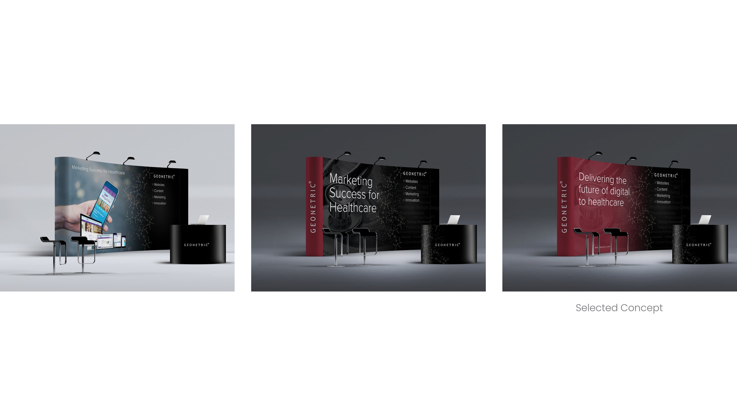
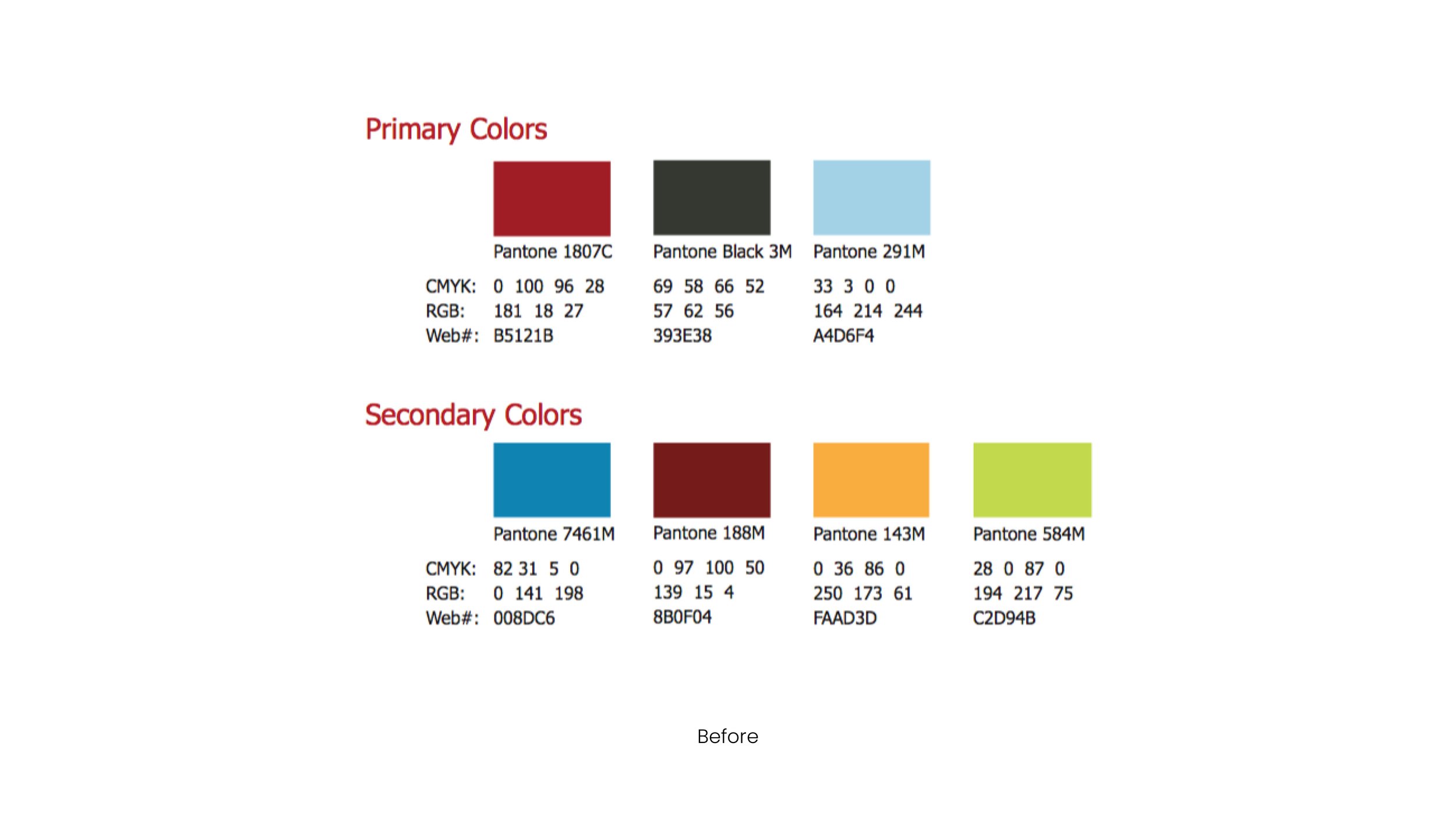
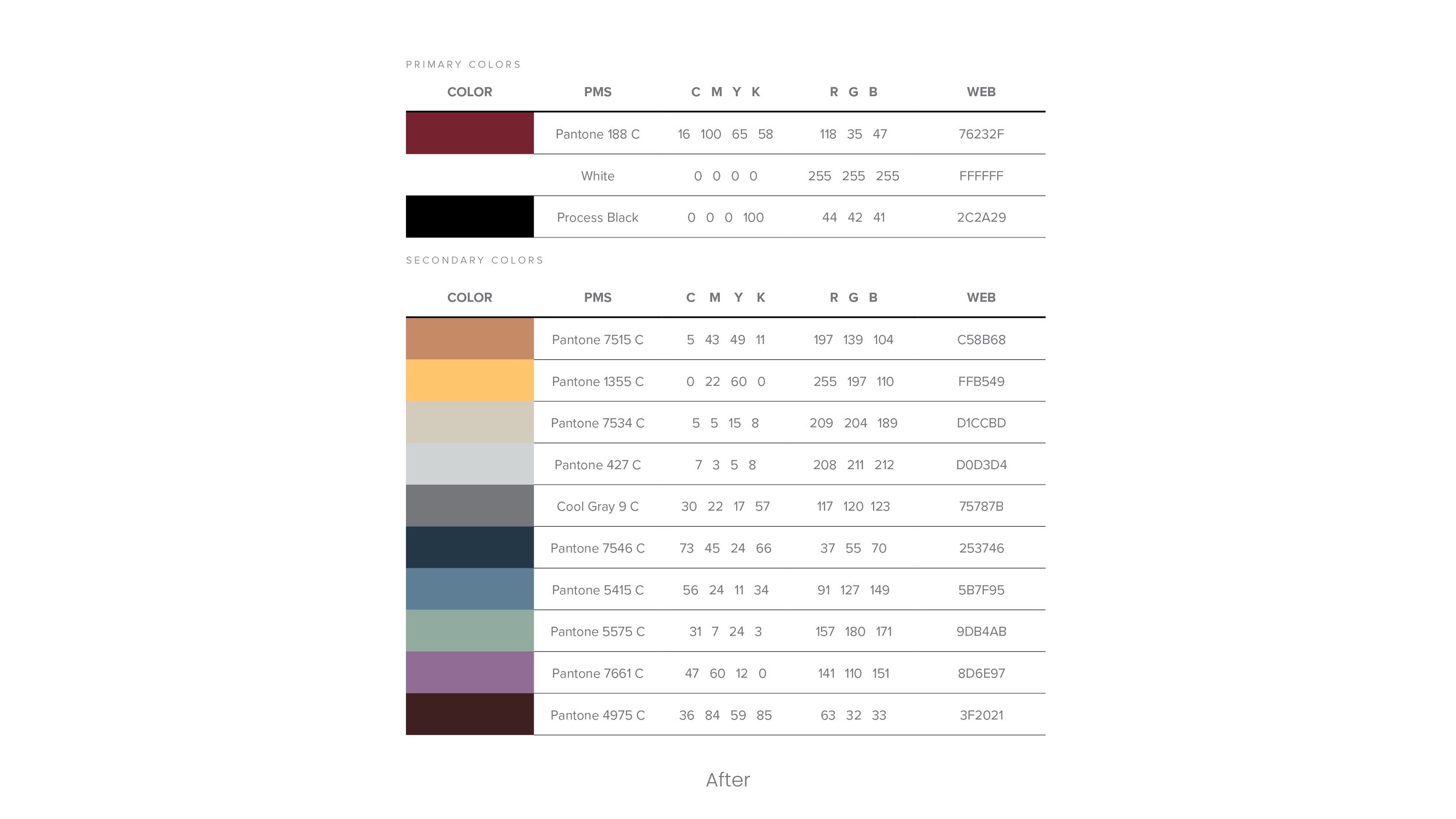
The trade show presence required more impactful branding elements to enhance visibility and recognition. The logo should've been repositioned to a higher location to ensure it remained visible even when conversations occurred in the booth. In addition, the podiums lacked any brand elements as they are prime surfaces to display logos or messaging. Furthermore, the booth design needed to align with Geonetric's brand colors to maintain consistency and strengthen brand recognition. The marketing materials used a limited red, black, and white color palette.
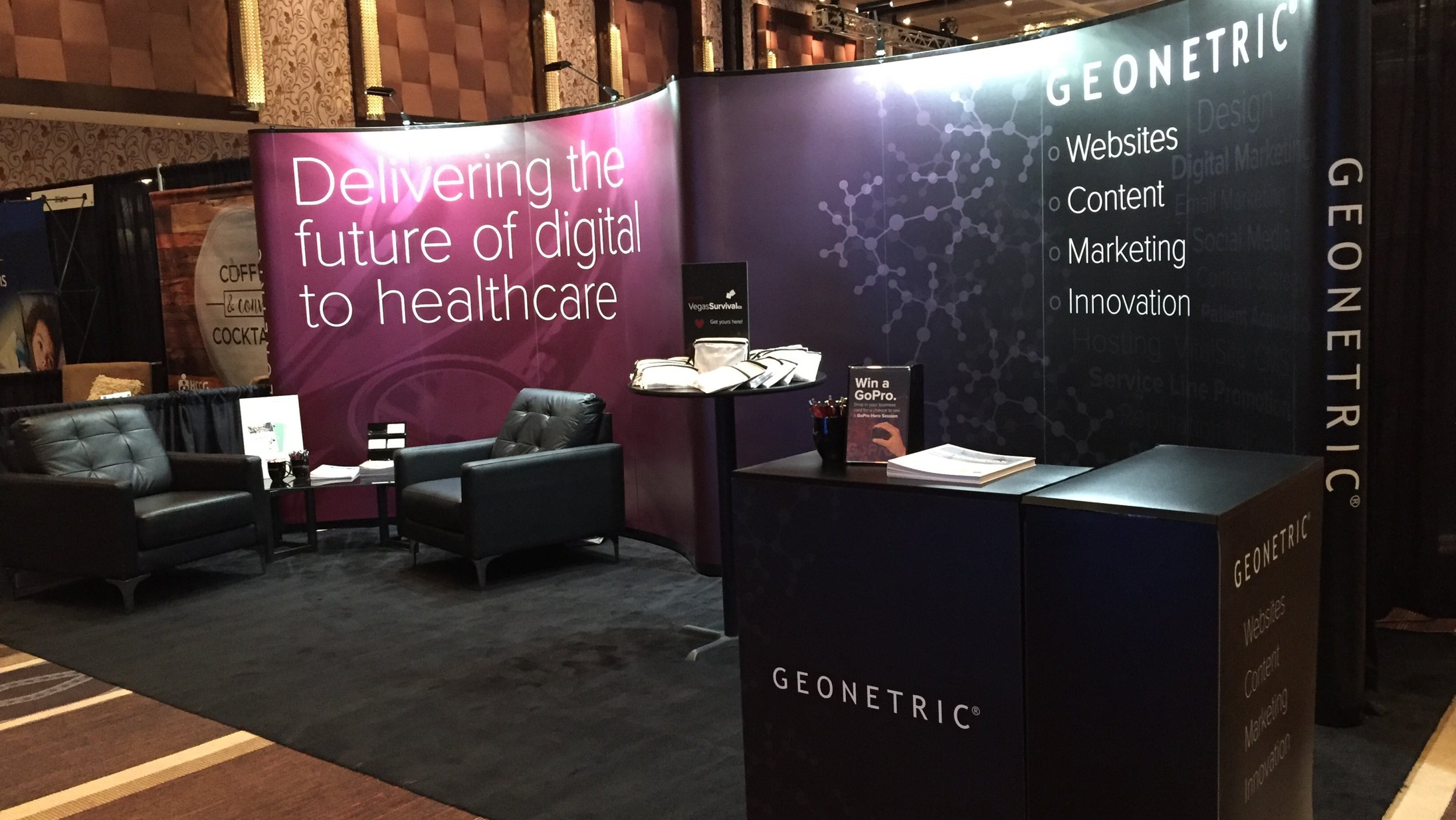
I attended trade shows to gather insights about Geonetric's competitors and determine how to improve their presence and strategy. I presented three concepts, and the one we chose received much attention at the following year's trade show. The black chairs provided a space for people to stop and talk to the sales team, and the black carpet and updated color scheme enhanced the brand. I also introduced a new color palette, replacing the loud red Pantone 187 with the maroon-hued Pantone 188. The logo was much more prominent, so trade show attendees no longer had to ask the sales team who they were with.
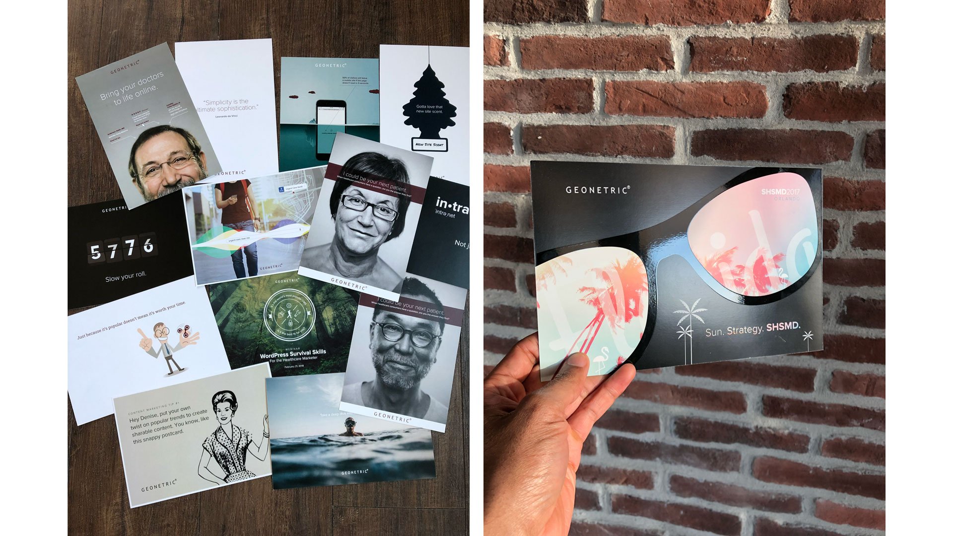
Additionally, booth traffic increased with creative trade show mailings, such as playing cards, ping pong balls, compelling prizes, and mailers, which grabbed the attention of trade show attendees.
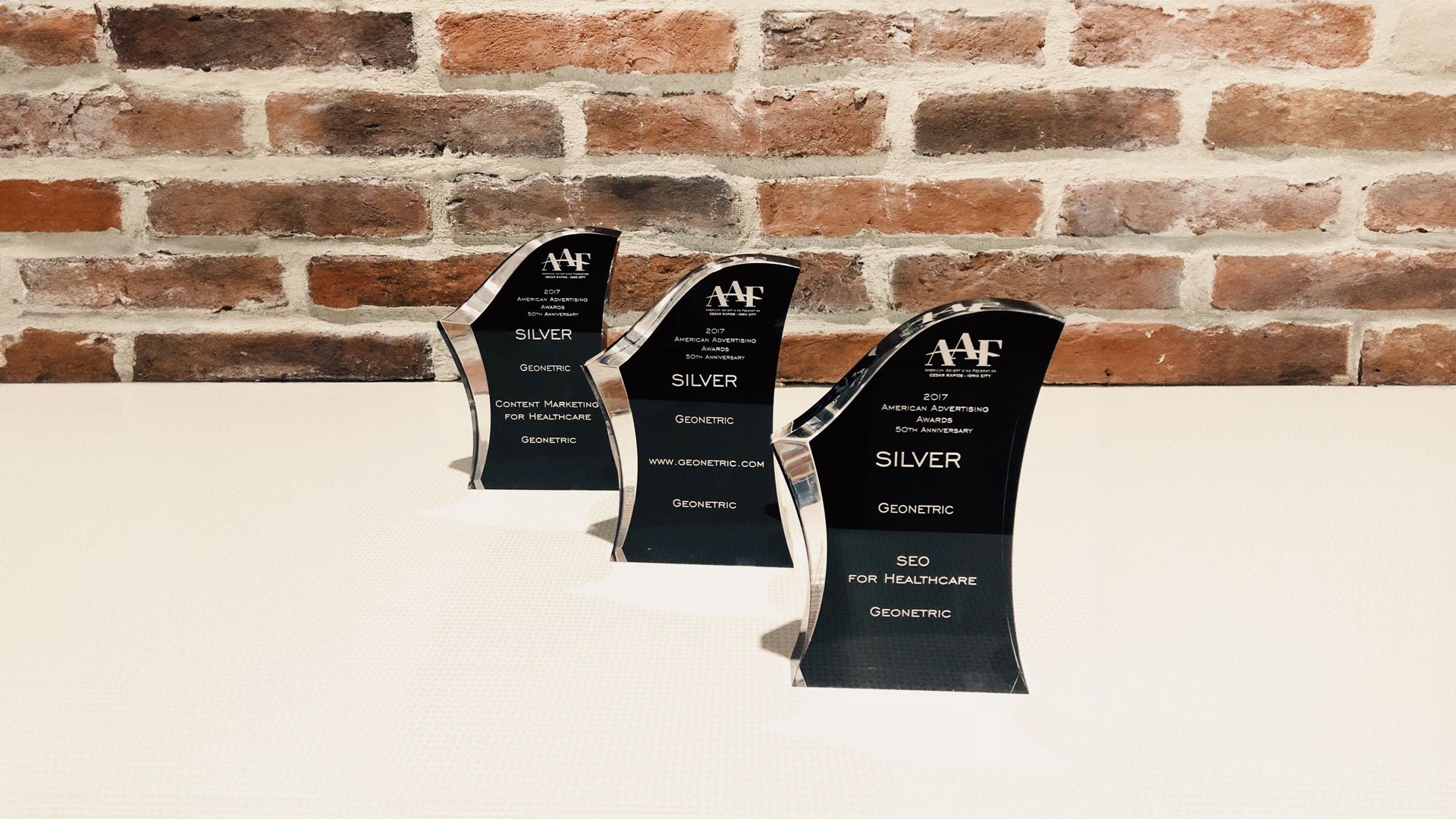
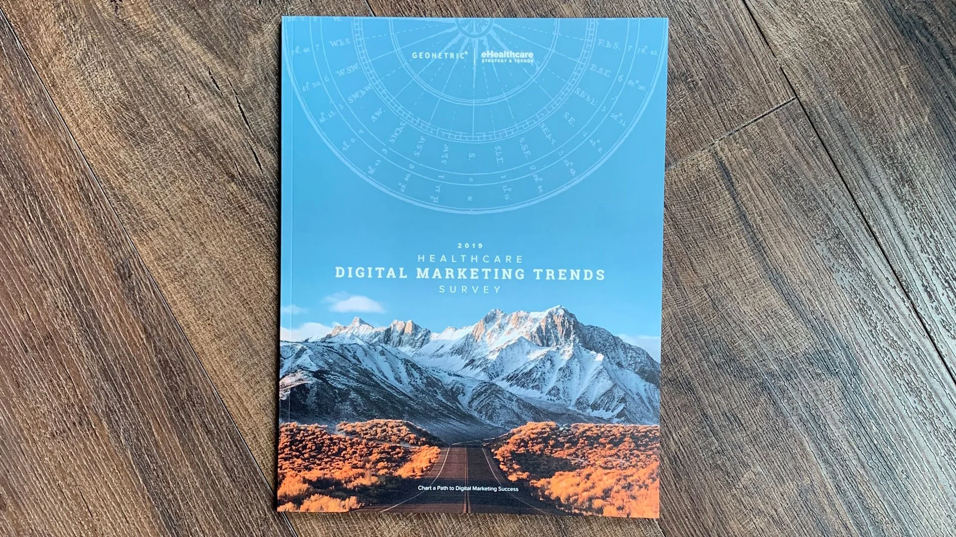
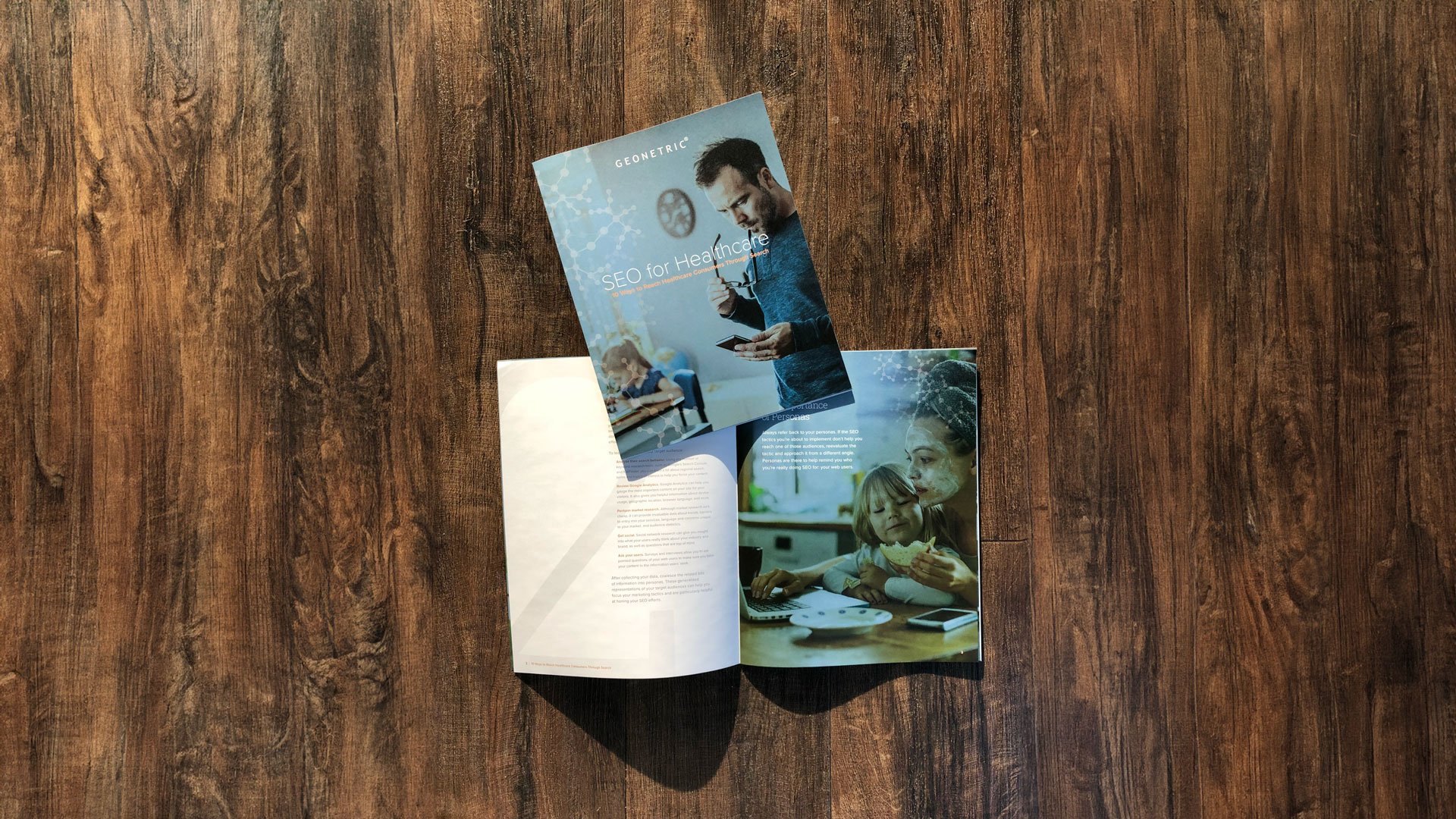
I designed award-winning brand collateral for "SEO for Healthcare" and "Content Marketing for Healthcare," using engaging typography, photography, charts, and graphs. Other print collateral used spot varnishes and die-cuts that caught the attention of prospective clients. The "Online Physician Promotion for the Healthcare Marketer" eBook was the most downloaded marketing piece in company history.
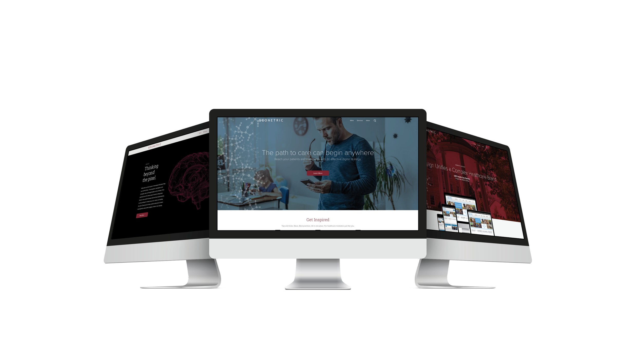
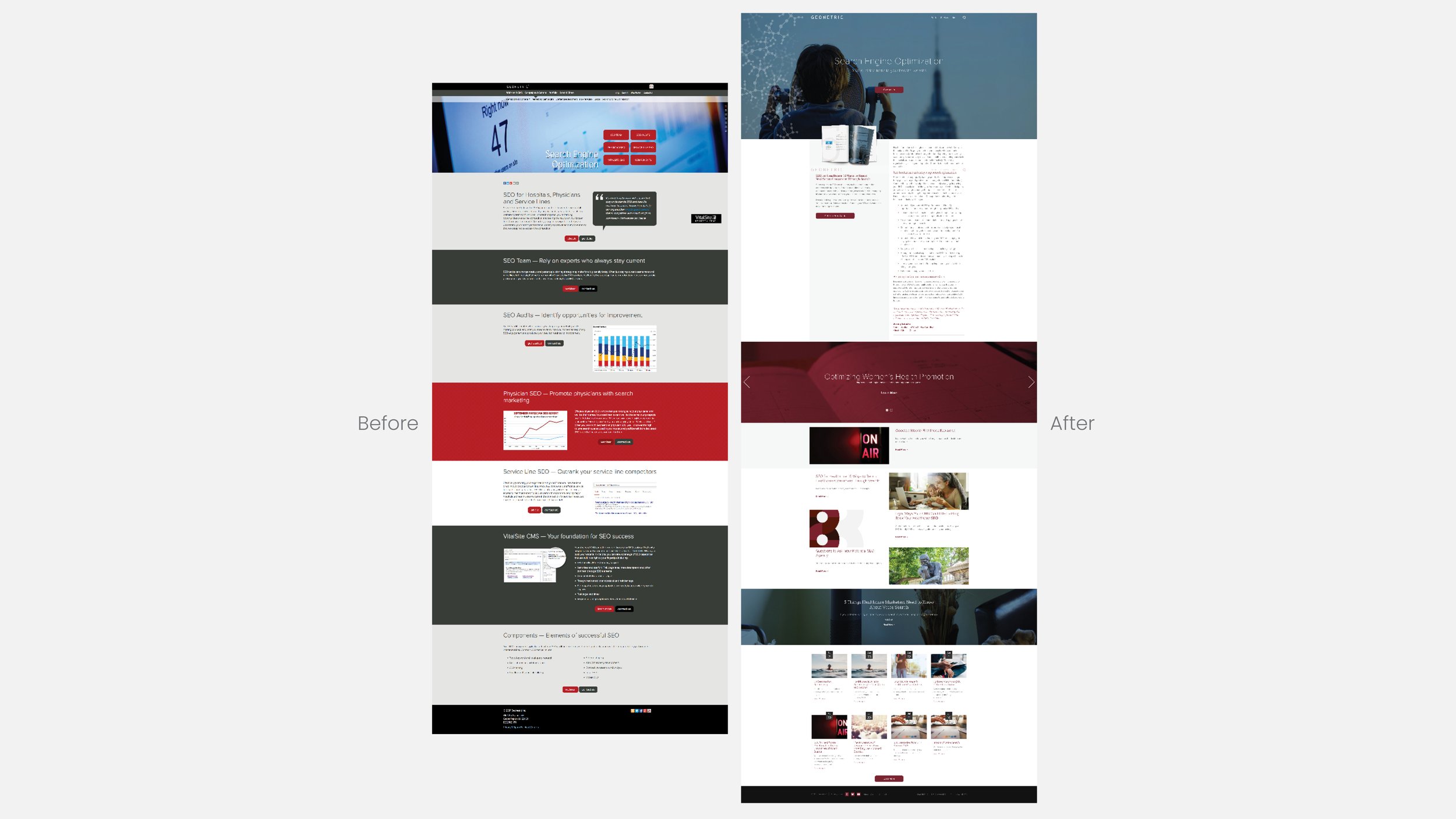
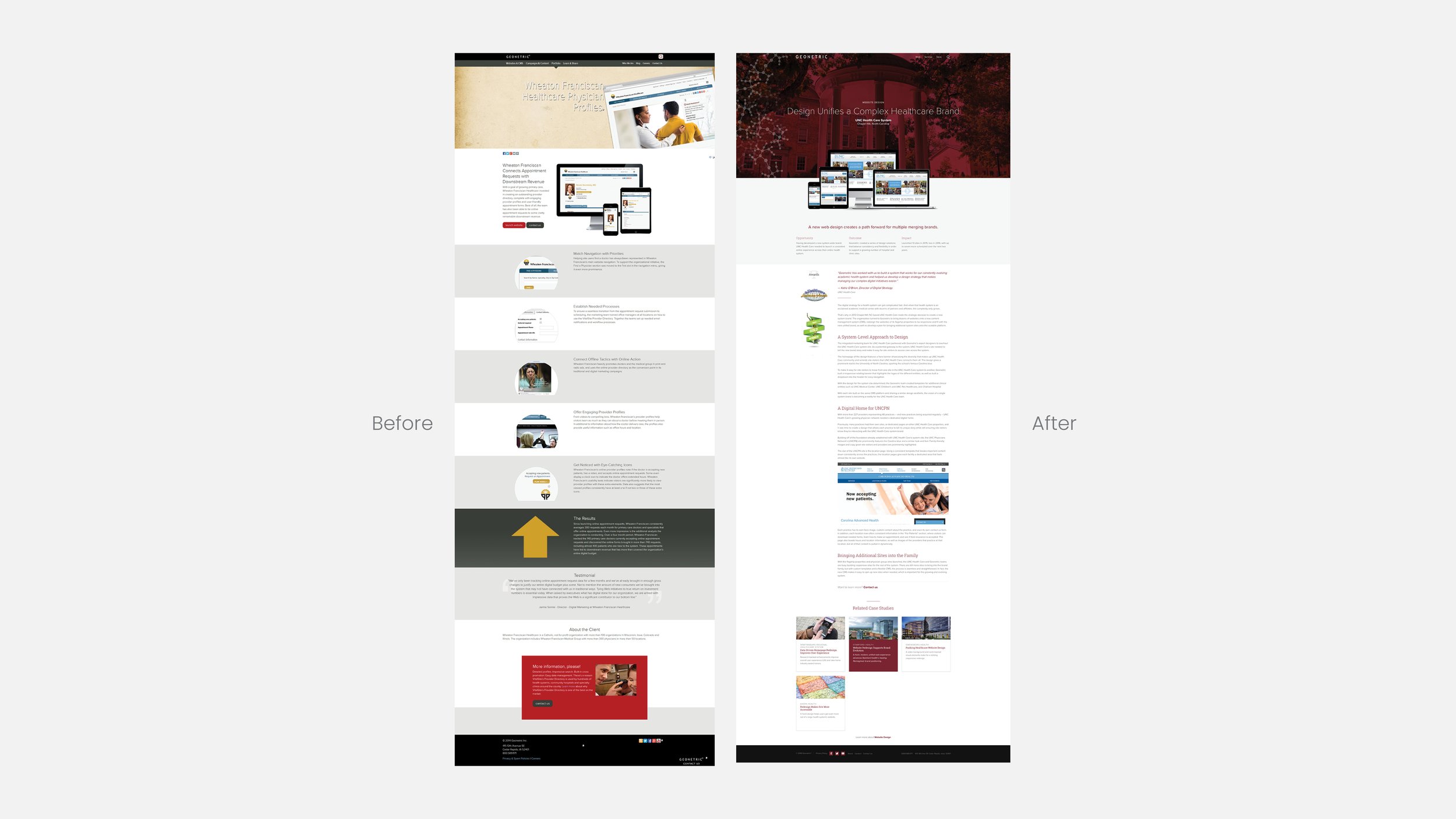
Geonetric's website redesign, which I led, was not just successful—it was a game-changer for the company, winning a Platinum MarCom and Silver AAF award. It was a testament to the effectiveness of strategy, content, and design. The redesign was not just about aesthetics—it was about creating a user-friendly and engaging platform.
The finishing touch was the redesign of the company logo, which was backed by research. I led internal surveys, conducted stakeholder interviews, helped facilitate client interviews, and presented the data to the company to inform the new logo. The logo was well-received internally, giving Geonetric the final element in the rebrand: a responsive logo and icon that matched the unique company name and positioned Geonetric as a digital agency.
Work done as Senior Visual Designer at Geonetric