A beloved grandmother and memories of summer fields inspired this classic brand identity.
Elizabeth had a vision for her cookie business—a brand identity exuding simplicity, timelessness, and classic charm, matching her intricate cookie designs.
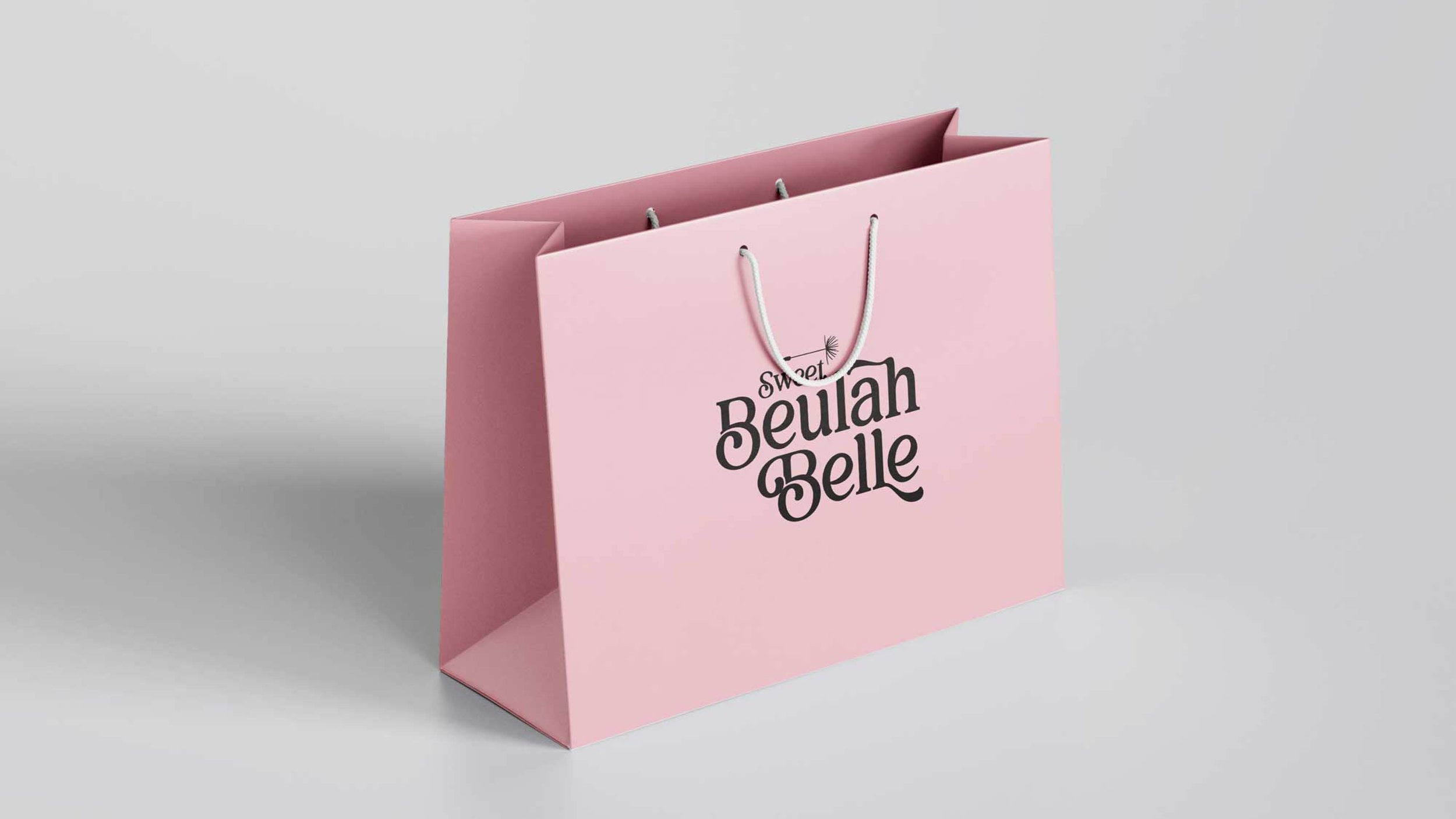
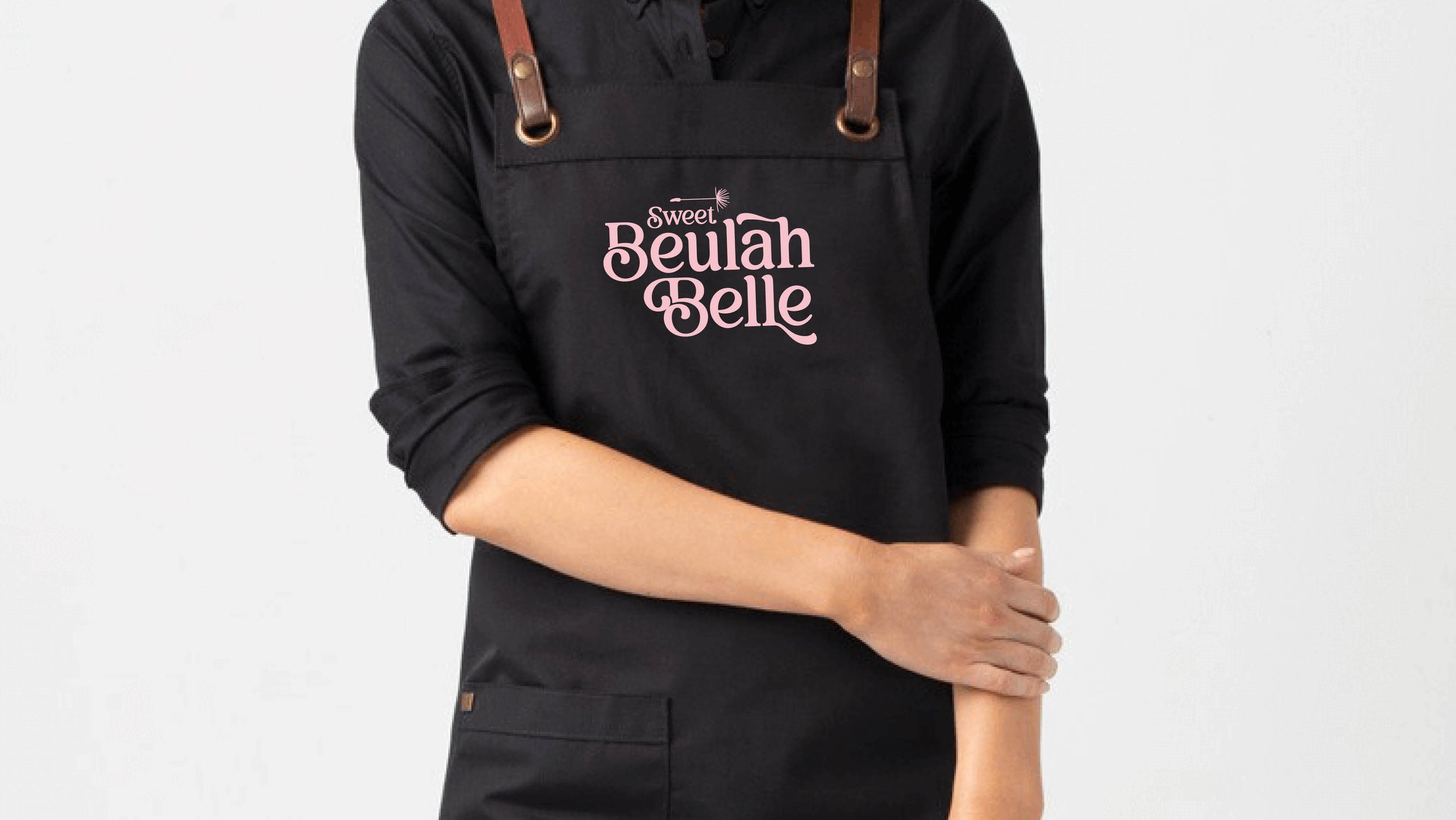
Elizabeth's customer base includes women in their 30s and 40s, brides, and guests at baby showers. My first goal was to nail down the perfect shade of pink, which was Pantone 699 C from her requested pink, black, and white color palette.
I balanced Sweet Beulah Belle's three words to ensure the logo remained compact, suitable for a mobile-first world, and easy to airbrush on cookies.
Additionally, the brand's name shared a number of the same letters in the words. There are two 'B's, three 'L's, and five 'E's. Handwritten script fonts felt forced, and sans-serif fonts lacked personality. I chose a versatile font with many ligatures and alternate characters to create a unique touch to the identity.
Balivia is a bold serif font designed to provide design choices. Its weights range from thin to black, giving an elegant, modern impression. The result is a stacked classic word mark-driven identity with a simple single pappas seed.
Elizabeth fondly remembers being out in her grandma's farm field in the summer. I'm honored to design a brand identity that honors the legacy of her grandma and brings people together with tasty treats.