A brand design for a carpenter dedicated to sustainability and eco-friendly practices
When Zack approached me to design a brand identity for his company, Studs Up Construction, which focused on residential housing, remodels, and custom builds, his goal was to have a 'sure-footed' identity that assured his customers they were in good hands.
After research and discovery, I presented a brand identity that avoided the cliches of the quintessential roofline or other tools of the trade that would cheapen his brand identity goals. Symbols like hammers would convey a limited scope of Studs Up Construction's services.
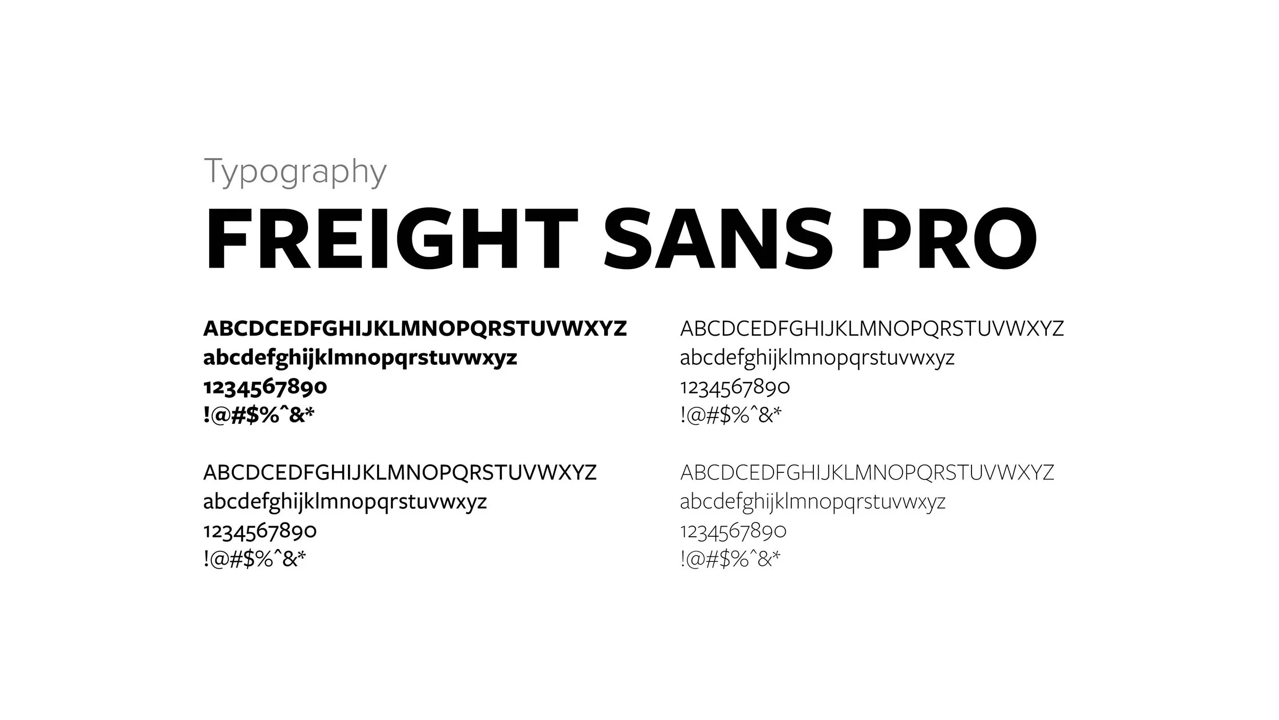
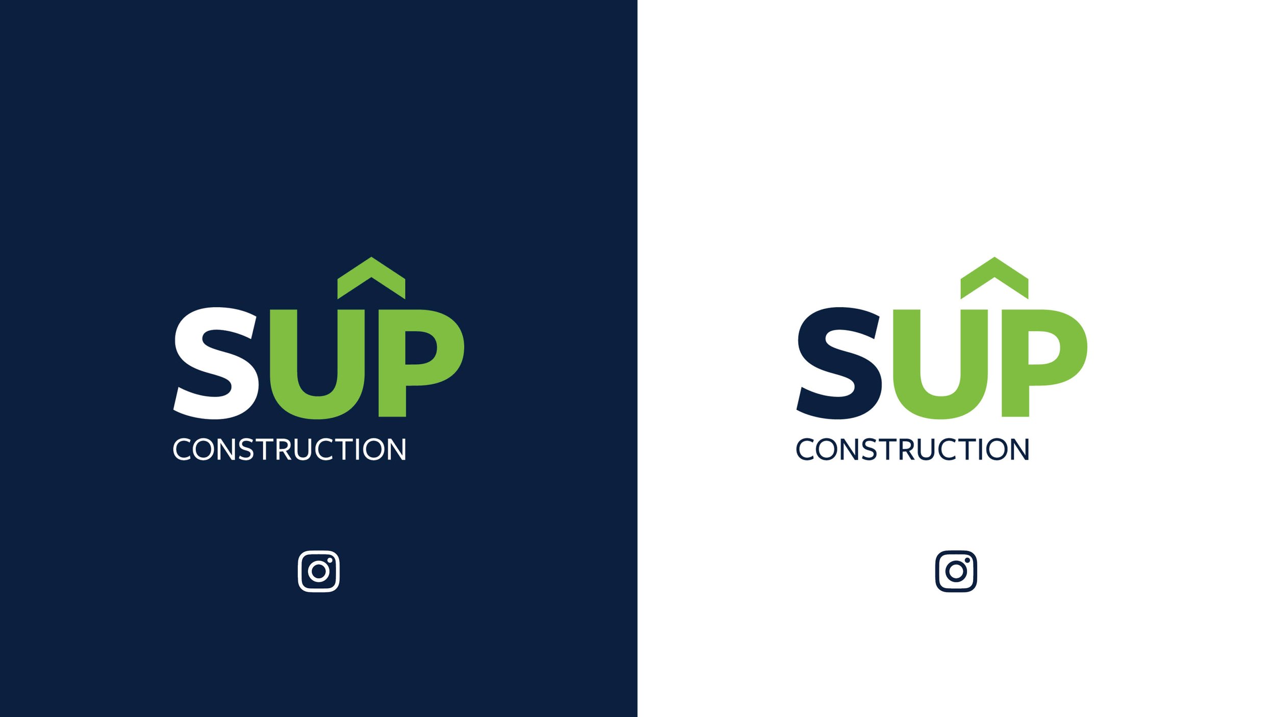
The Stilhl, Steelcraft, and FedEx brand identities inspired Zack. I presented an all-caps identity, achieving the strength and stability he sought. Combining the words created a single bold wordmark. With the name signifying framing and wood, Freight Sans Pro conveyed a solid, straightforward, and bold aesthetic.
Combining Studs Up and setting 'UP' in green emphasizes both words simultaneously. A classic chevron shape points up, highlighting the progress and upward momentum in the construction process. This chevron symbol creates a timeless rooftop shape and an additional arrow in the negative space.
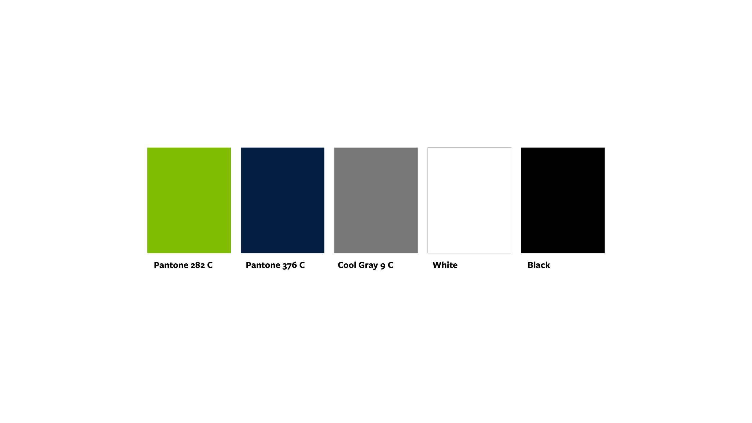
The green and blue color palette speaks to the green and blue earth we call home and echoes Zack's goal of sustainability and eco-friendly practices.