Modern branding for an orthodontics office that breaks the mold.
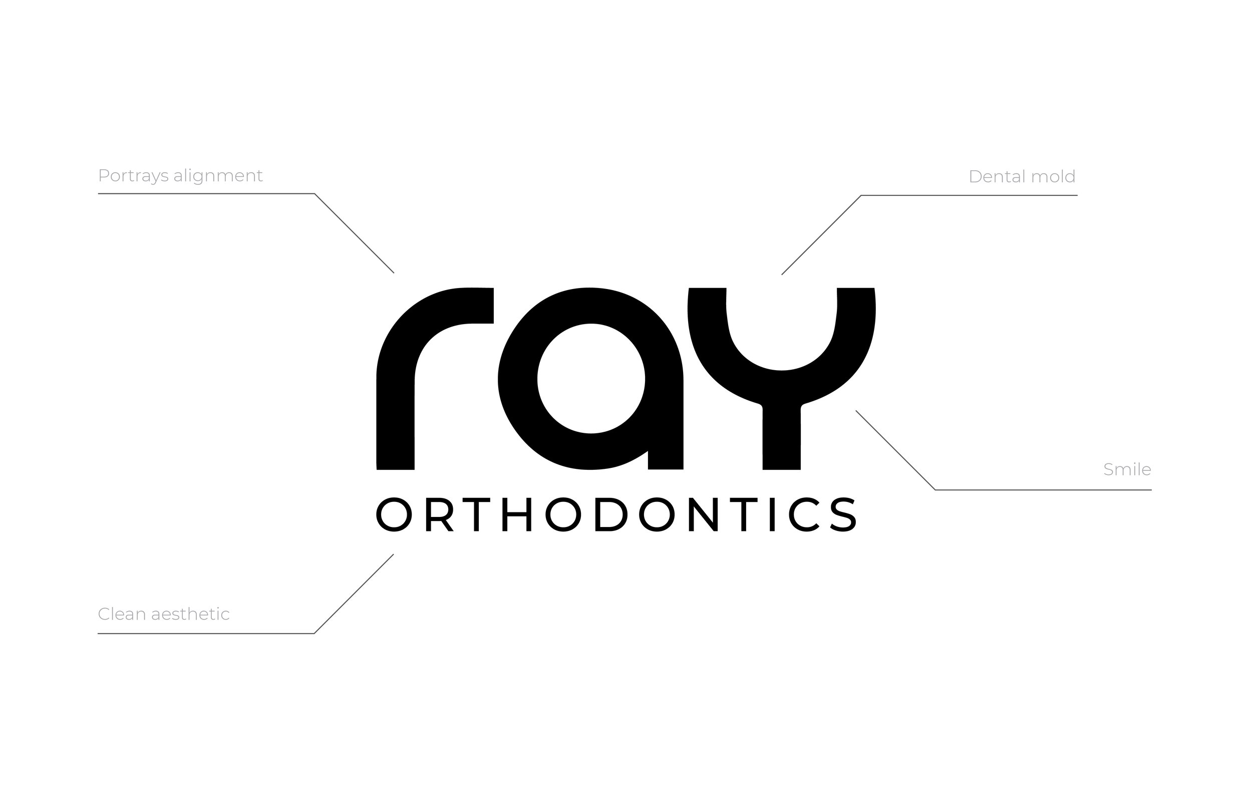
Designing a modern brand identity for Ray Orthodontics, distinct from the typical clichés of braces or a tooth, was a memorable challenge. Unlike many orthodontic brands that use cheap, clipart-like design elements, I aimed to create a brand that broke the mold. After all, choosing an orthodontist is an investment in a healthy, confident, million-dollar smile.
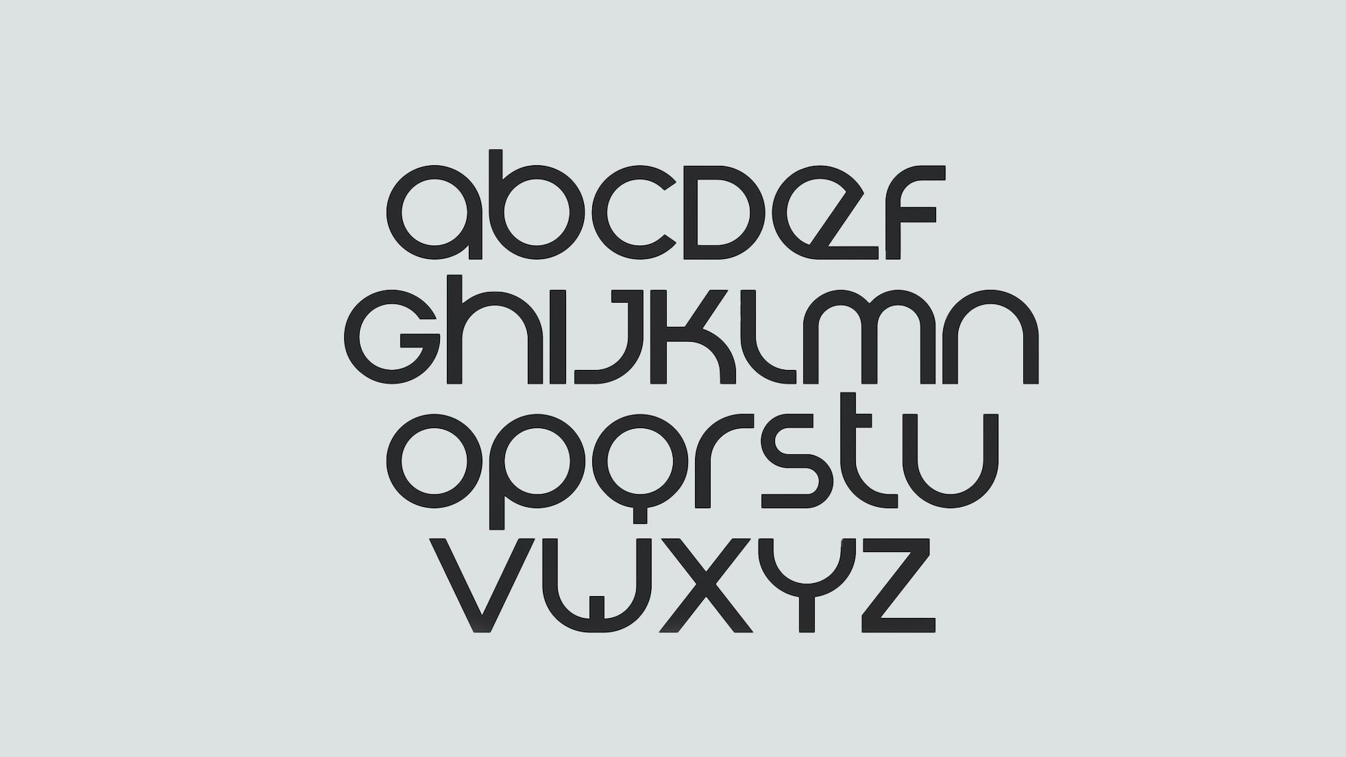
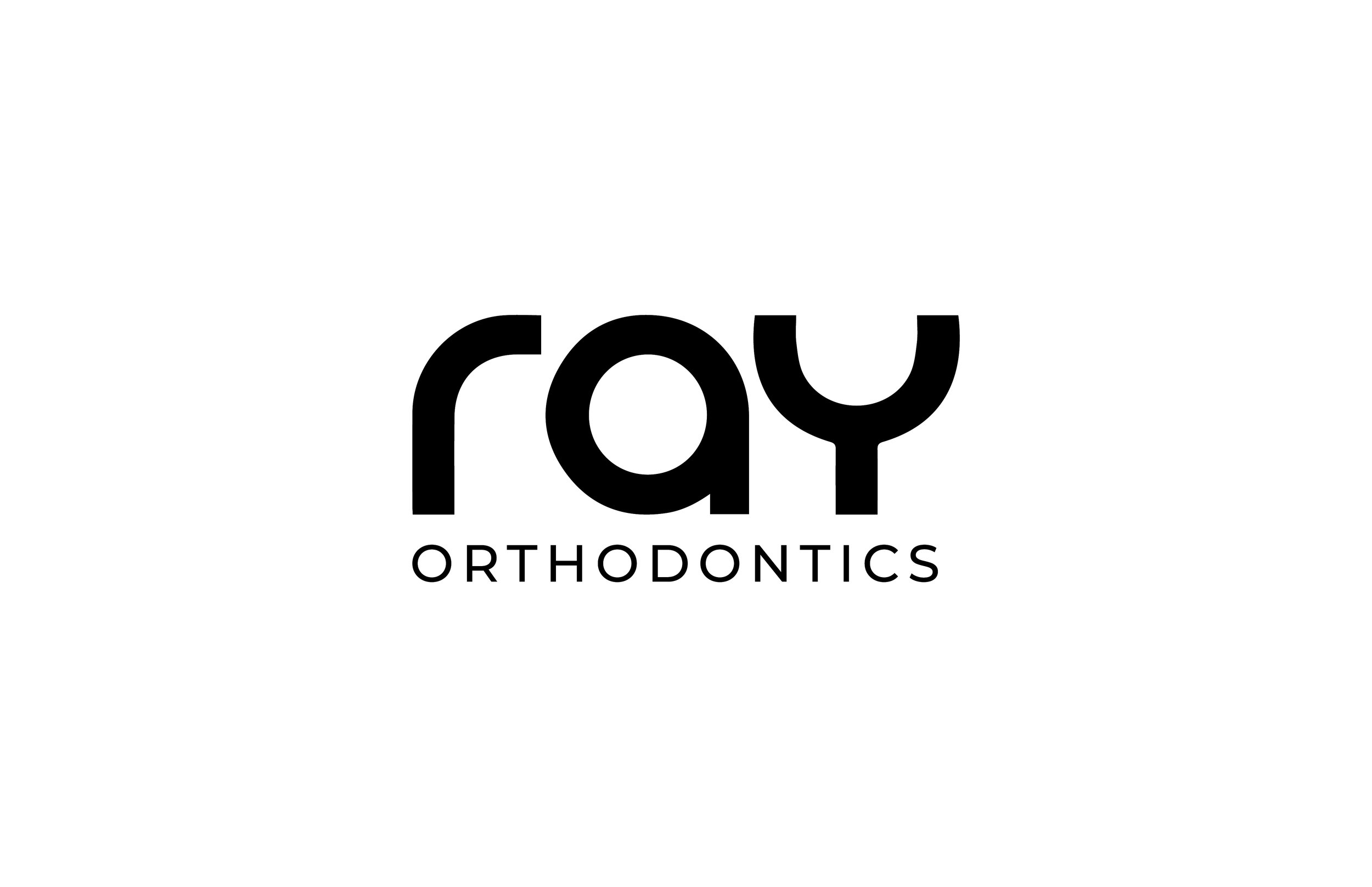
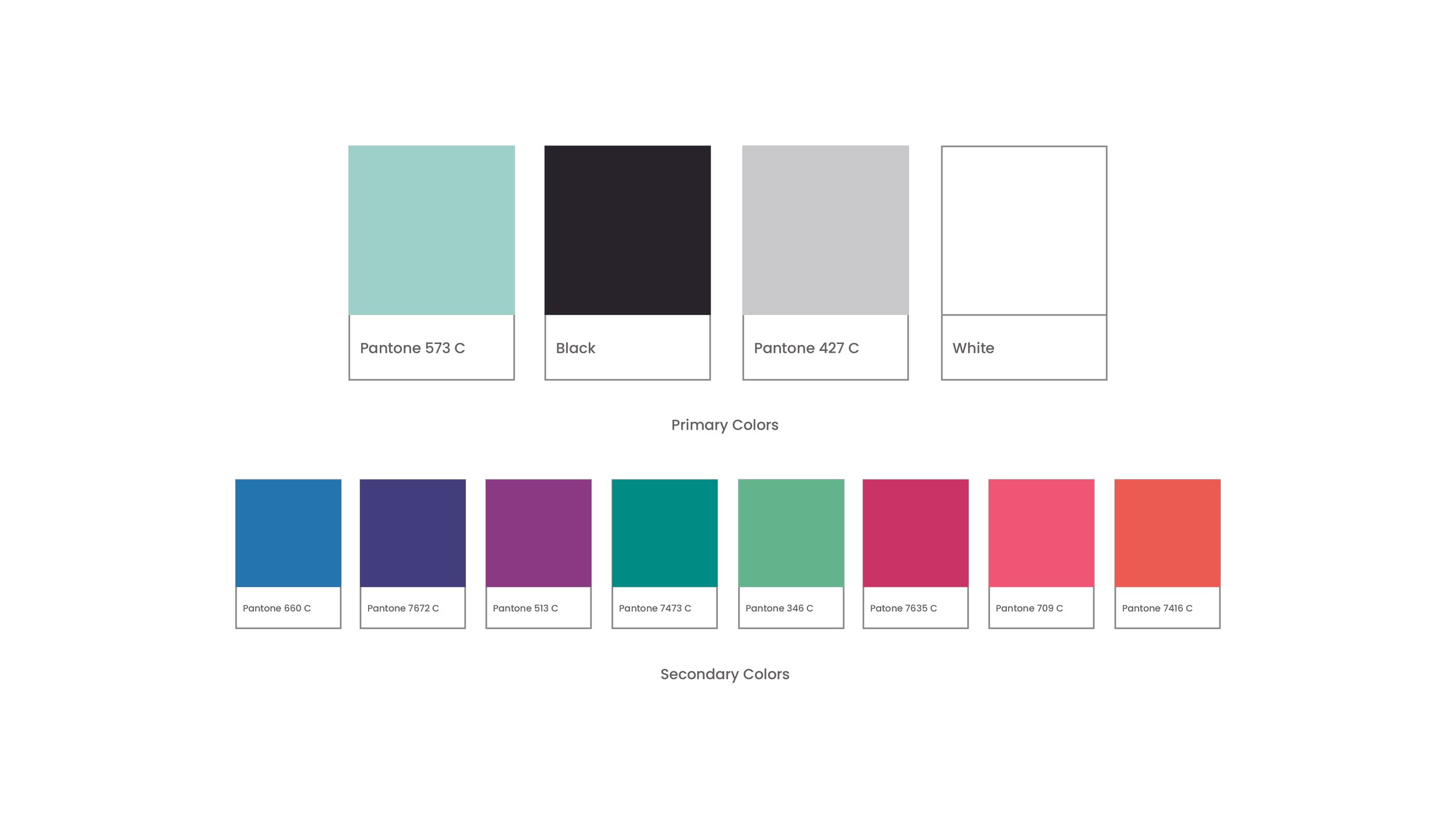
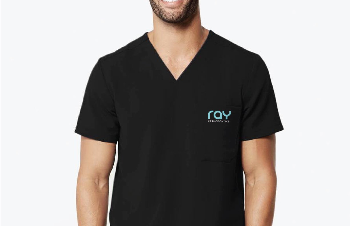
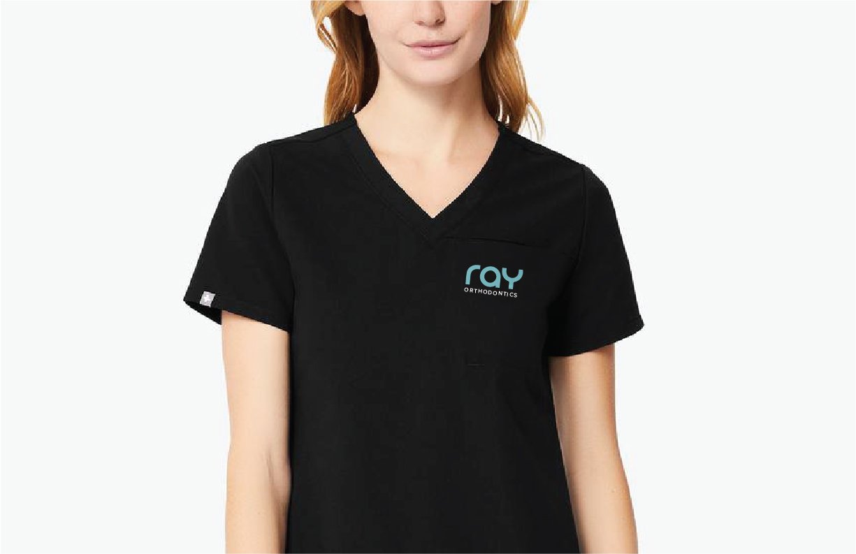
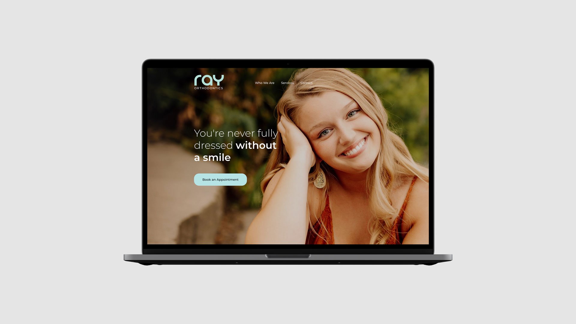
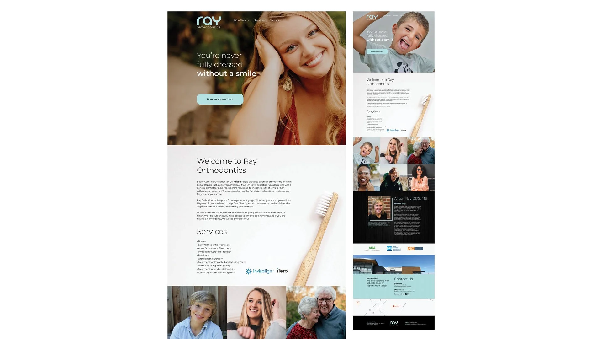
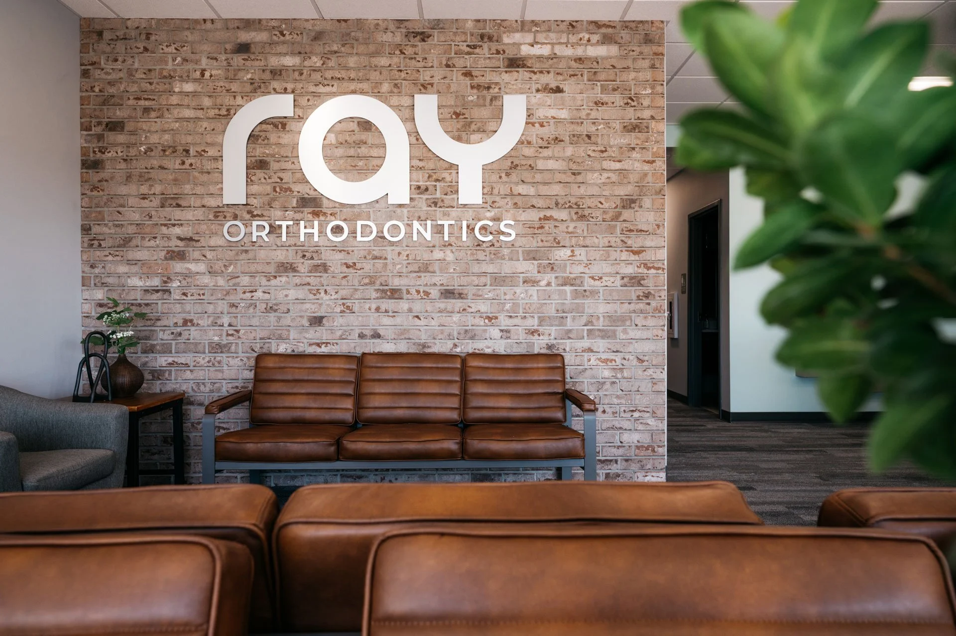
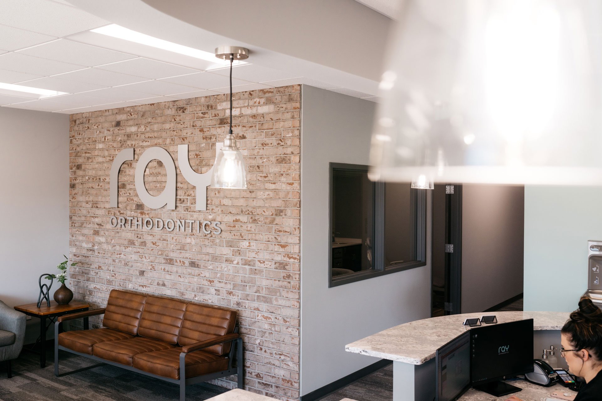
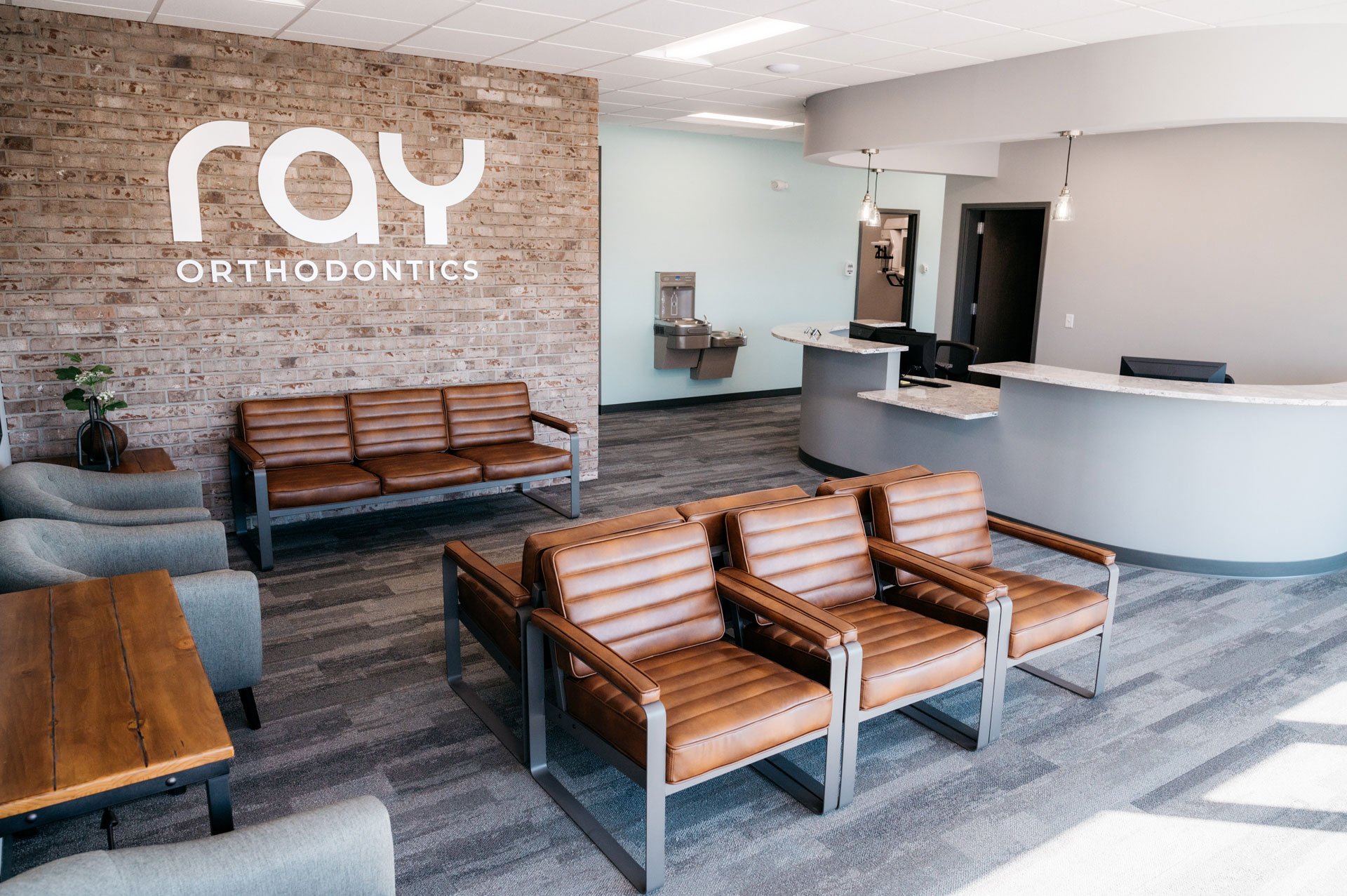
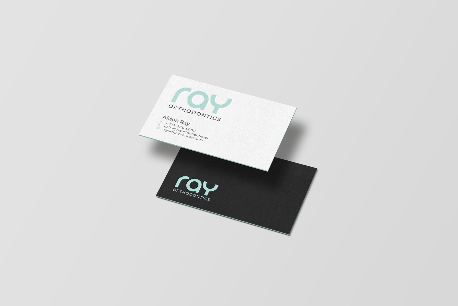
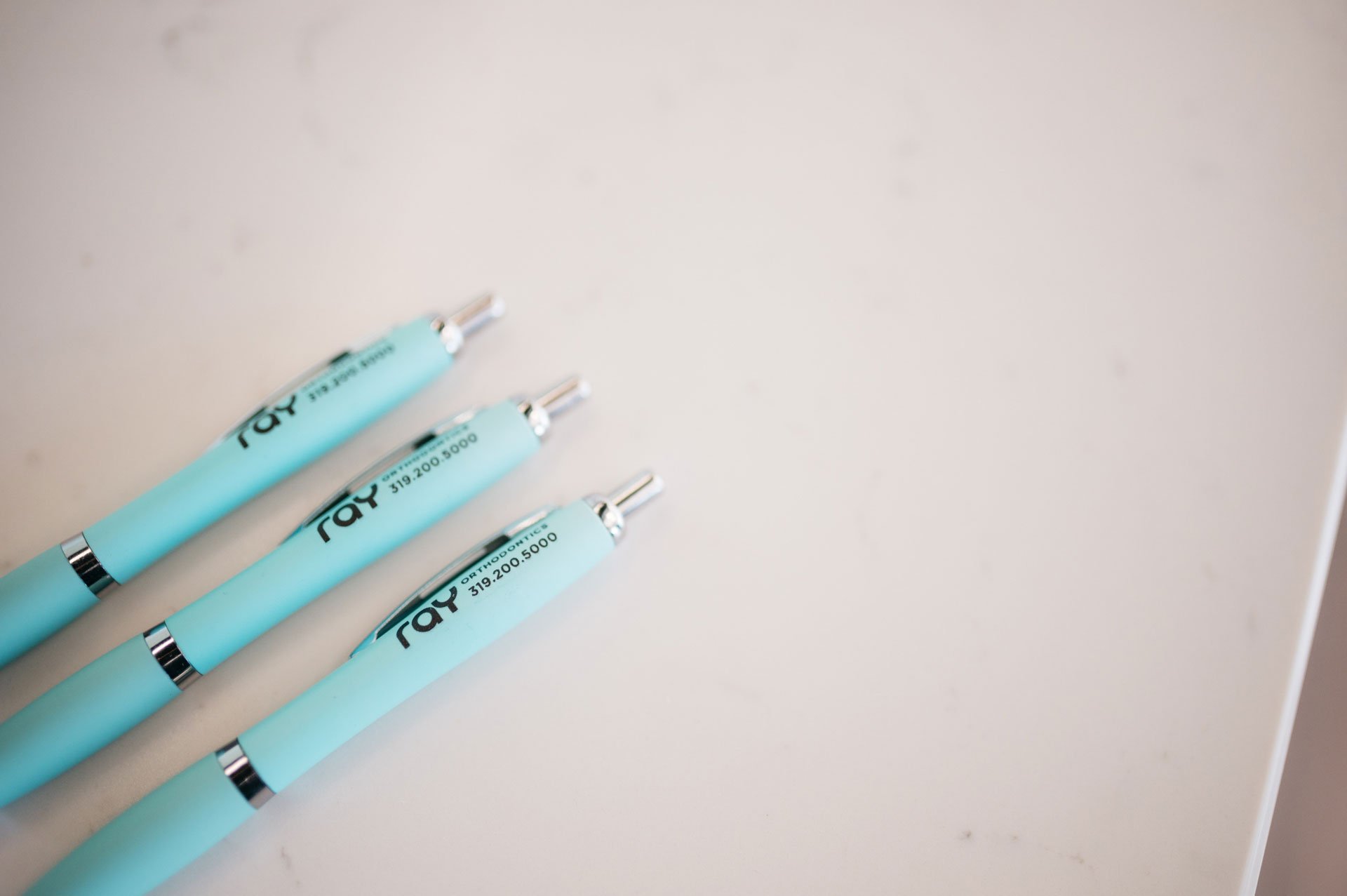
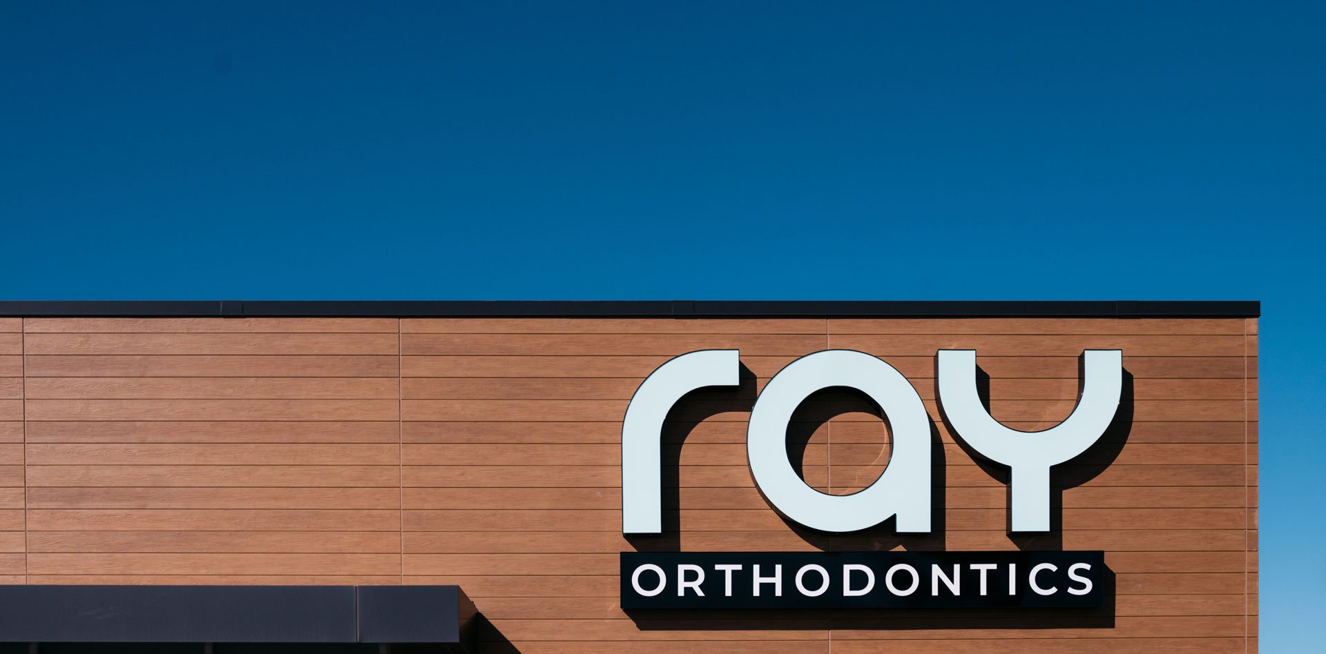
With the brand named after Alison's three-letter last name, I pursued a wordmark-driven brand identity. Typography would play a pivotal role with the emphasis on the name Ray. Orborn and Ray were a match made in heaven, with many of the font's characteristics carrying the aesthetic of dentistry and orthodontics in healthcare. The client requested a minty green color. I selected Pantone 573 C and built a complementary color palette. The project included a website and office photoshoot.
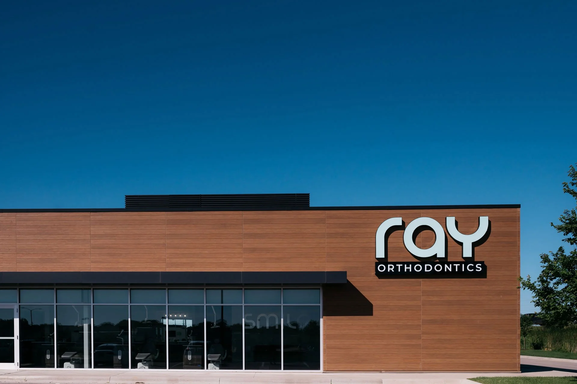
The brand identity not only met but exceeded the client's expectations. This success was evident when the office opened its first location, with many new patients walking in from the signage alone. Ray Orthodontics is located in West Dale Town Center in Cedar Rapids, Iowa.
Created as lead designer at Meld Marketing. Photography by DJ Freesmeier