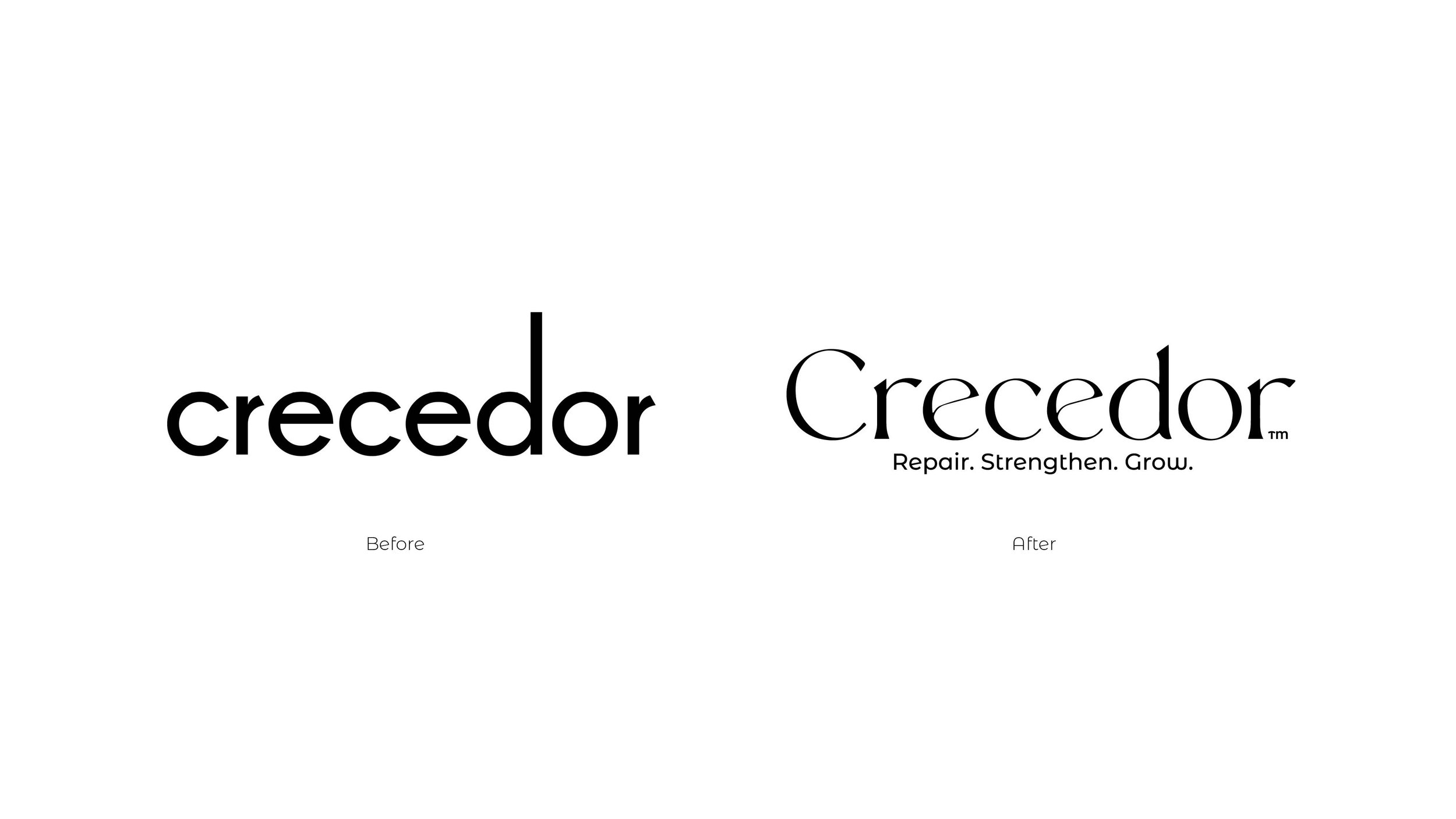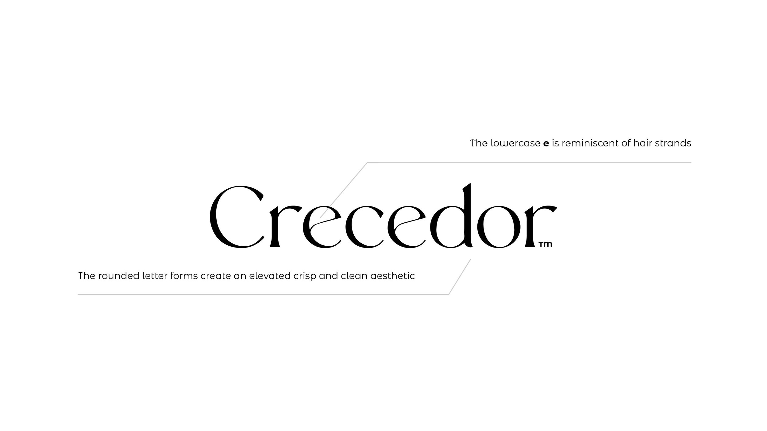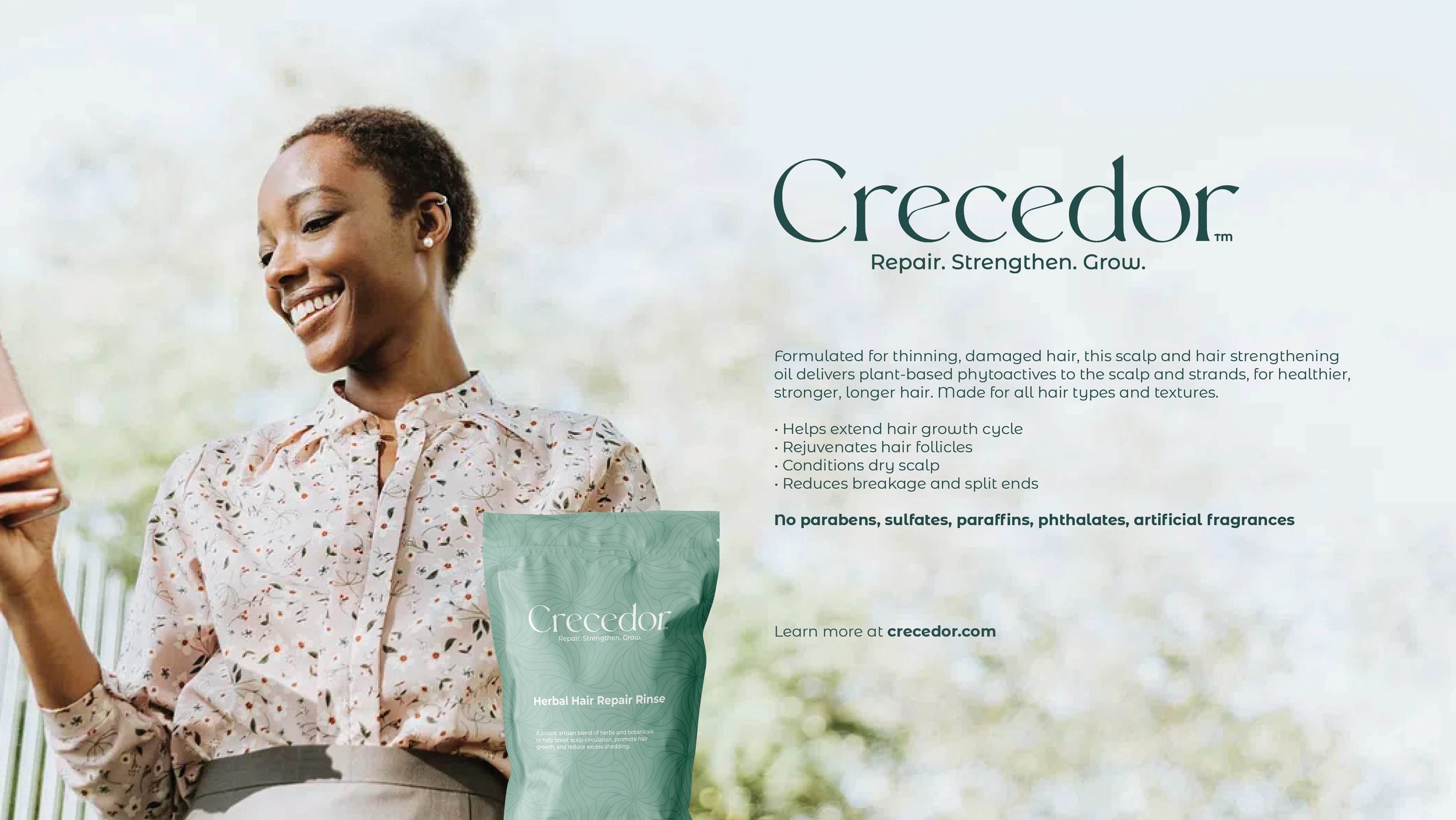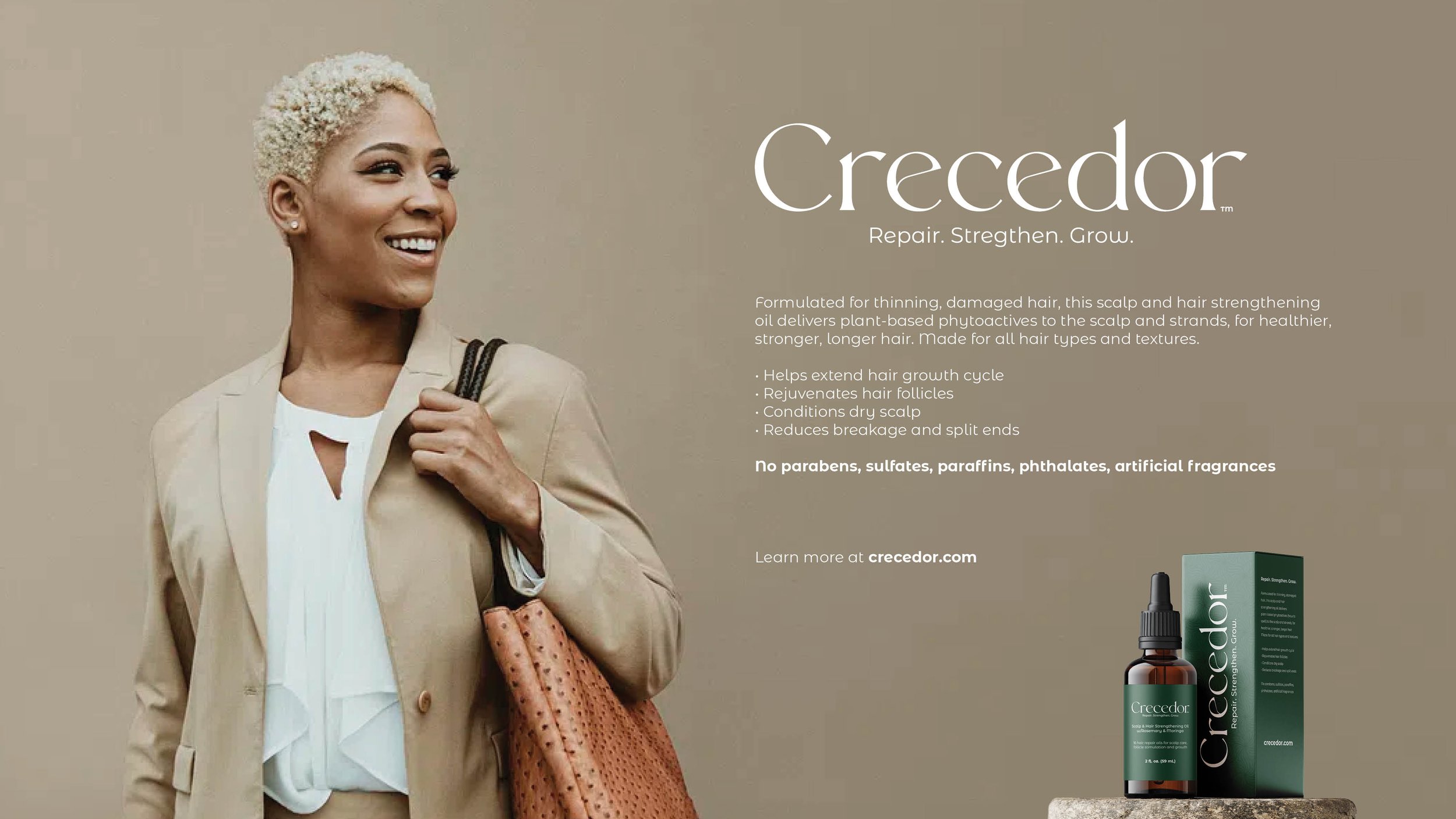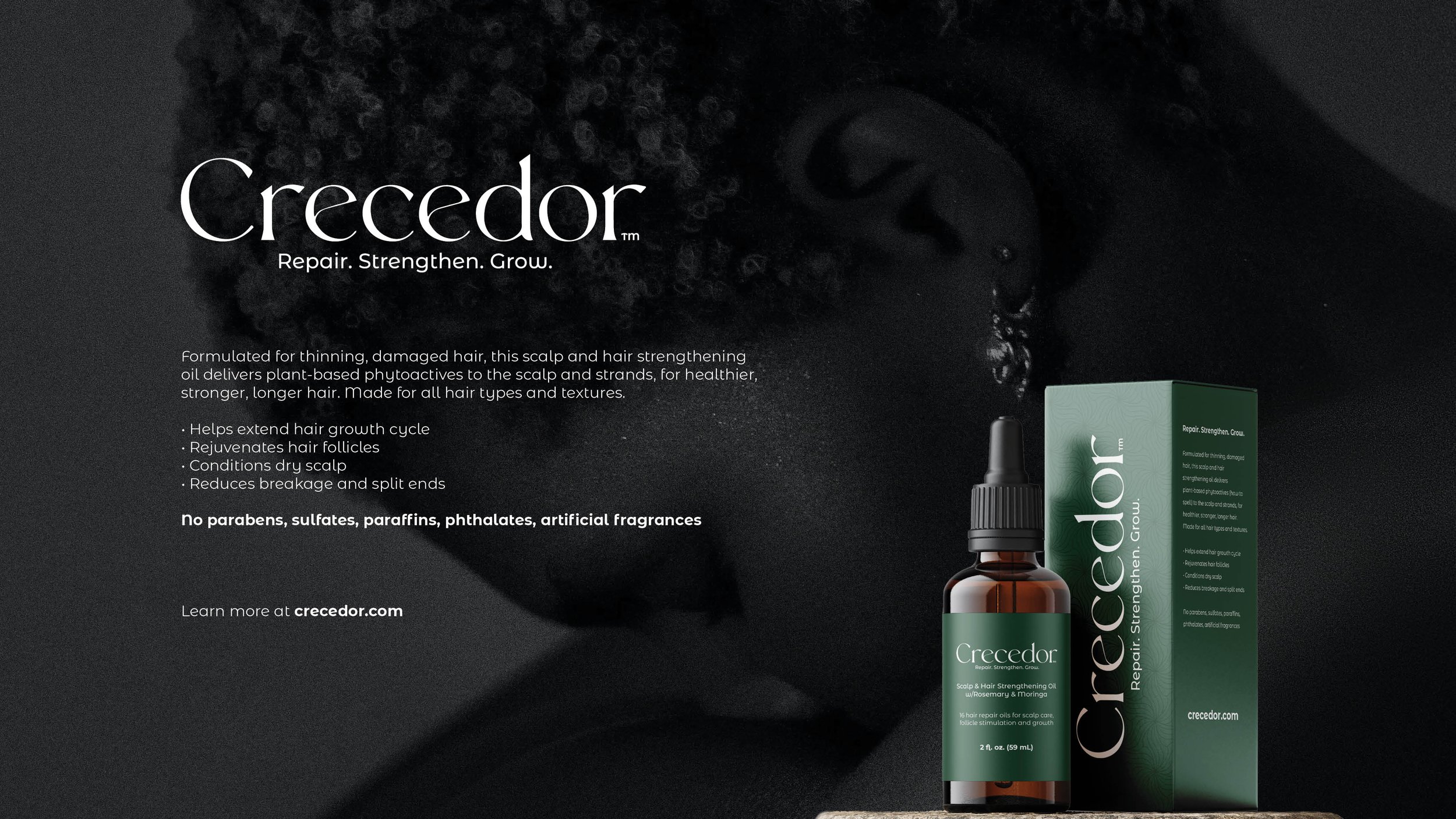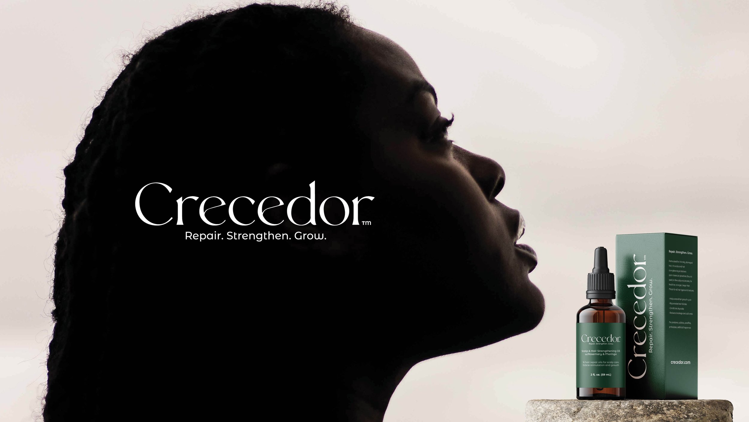
Crecedor: From the Spanish root word, crecer, which means to grow, to blossom, to burst forth
Jason and Melissa were in search of a complete brand and packaging design for their newly launched product, Crecedor. Melissa, who had a personal experience with hair loss, was deeply committed to finding a solution. Her relentless efforts and dedication led to the development of a proven formula. Her ultimate goal was to launch a chemical-free, plant-based solution to help others who were also struggling with hair loss.
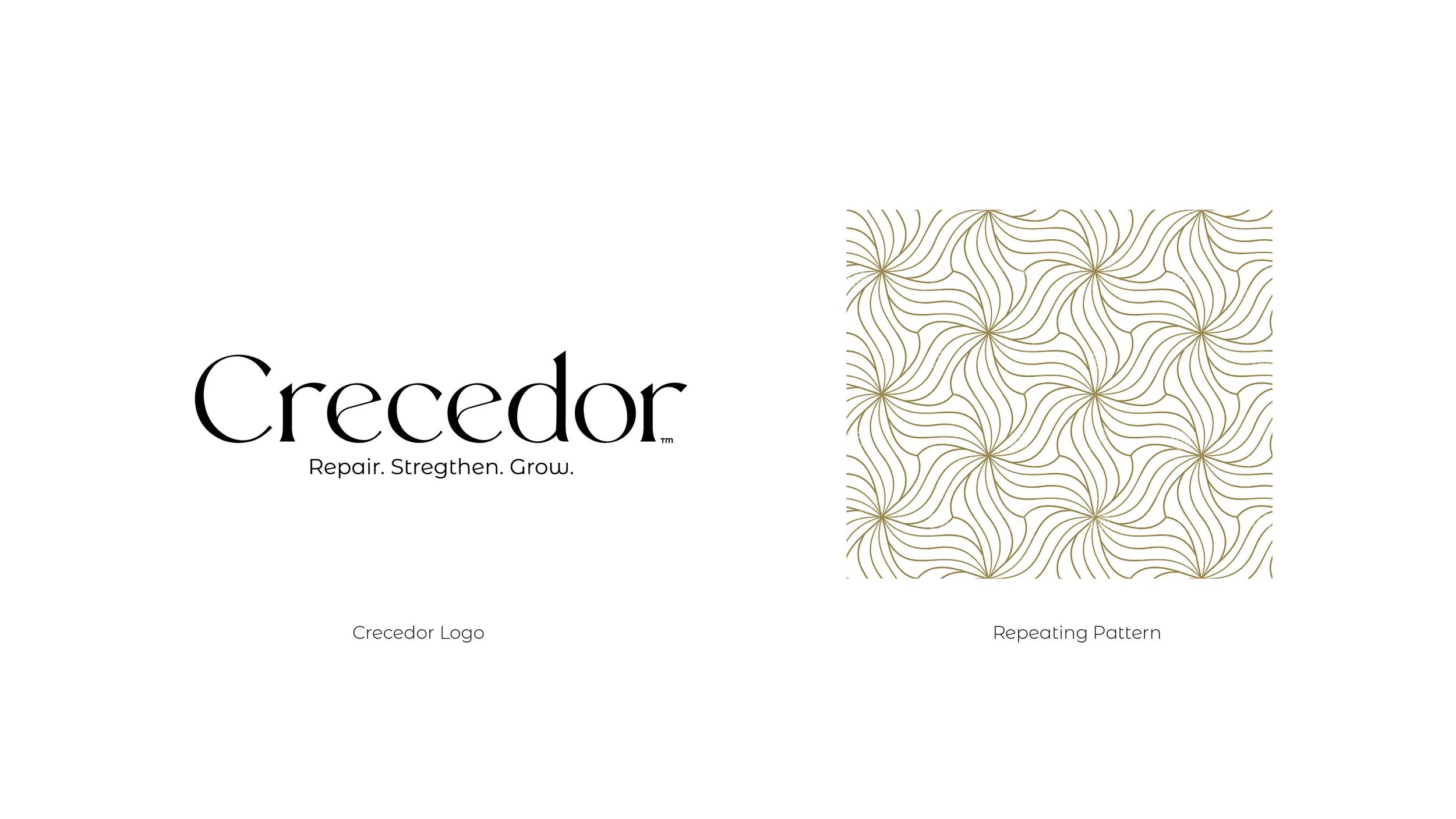
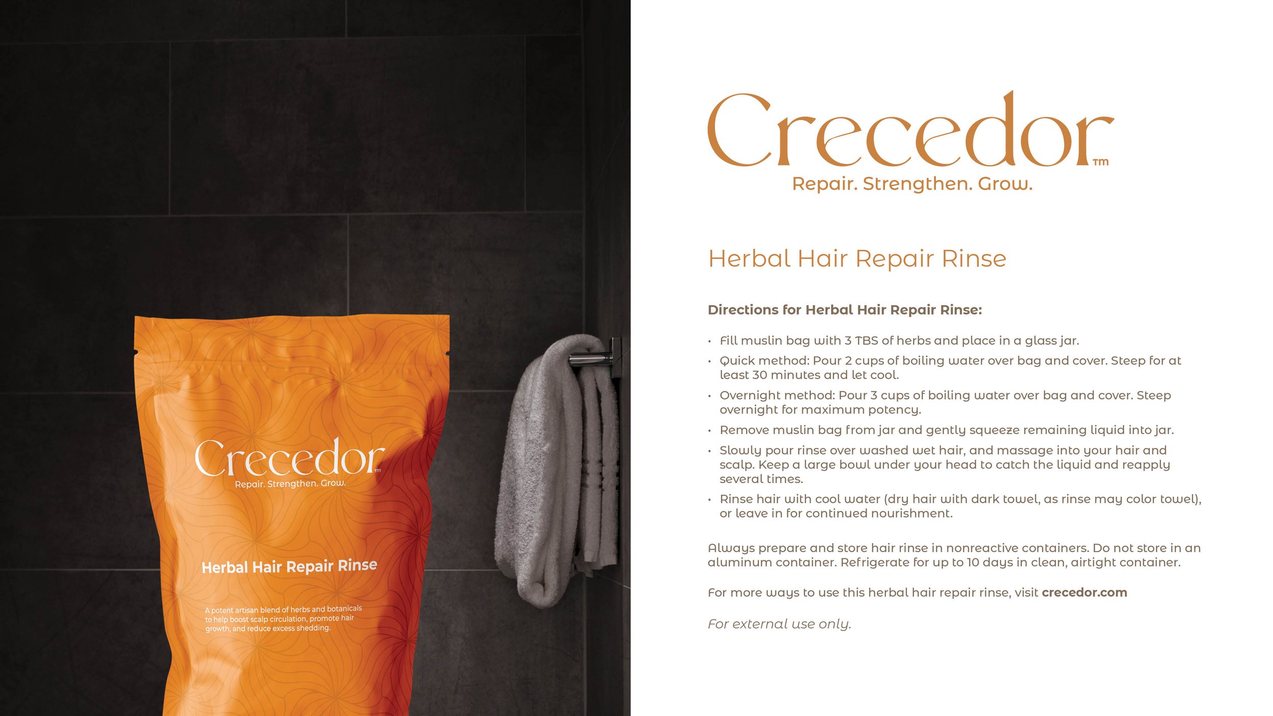
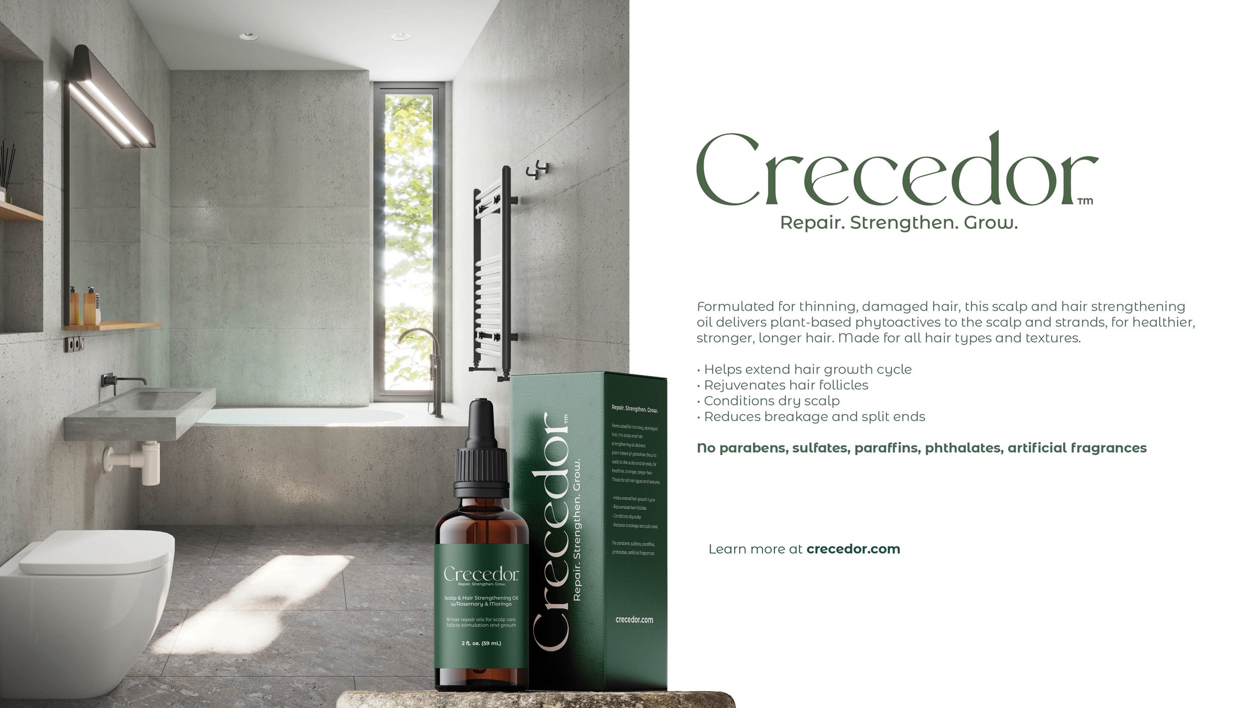
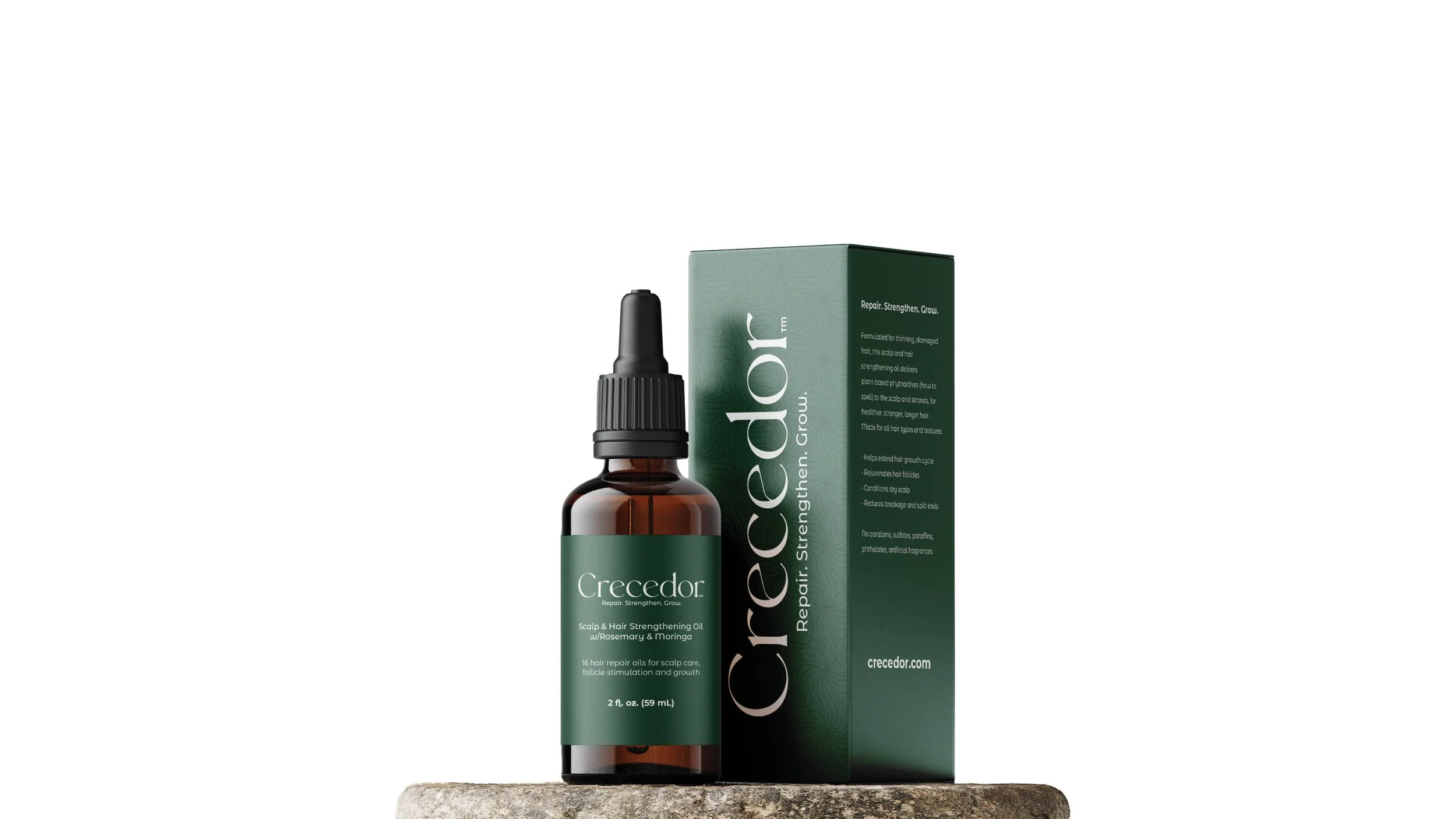
My approach was to introduce a clean, crisp, and refreshing identity with a design reminiscent of hair strands and floral tones. The color palette was inspired by the organic plant-based ingredients in Crecedor's products.
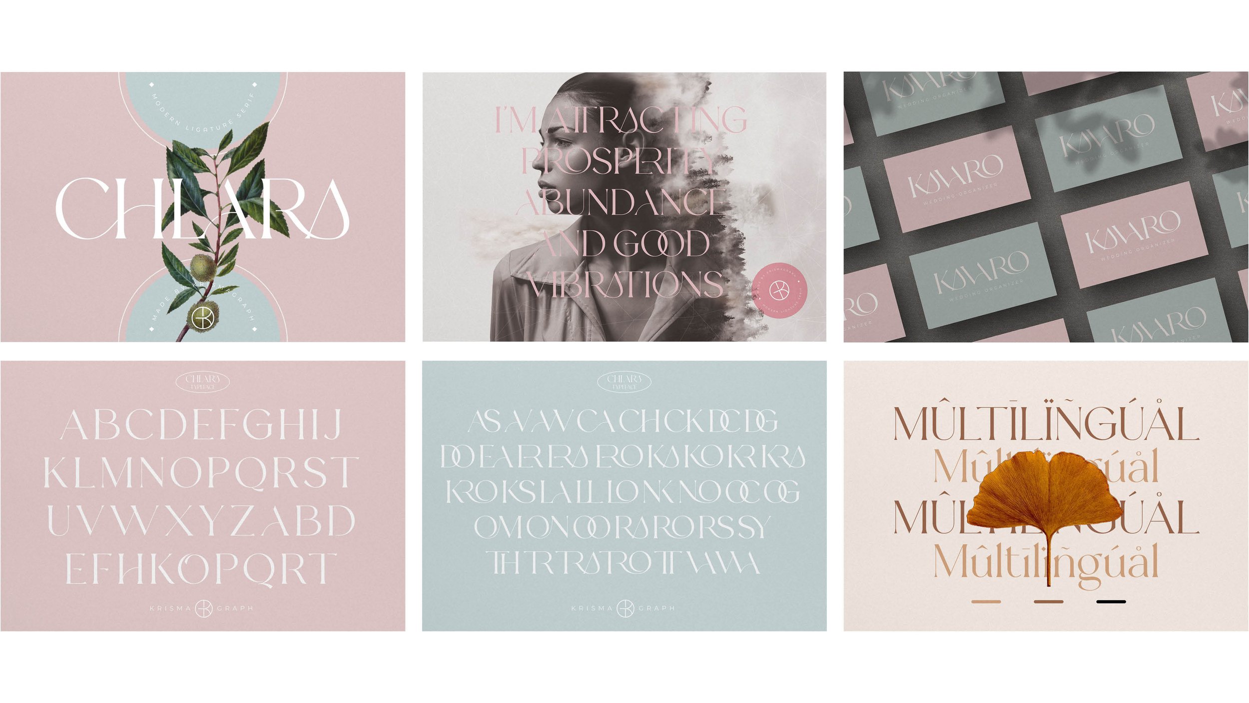
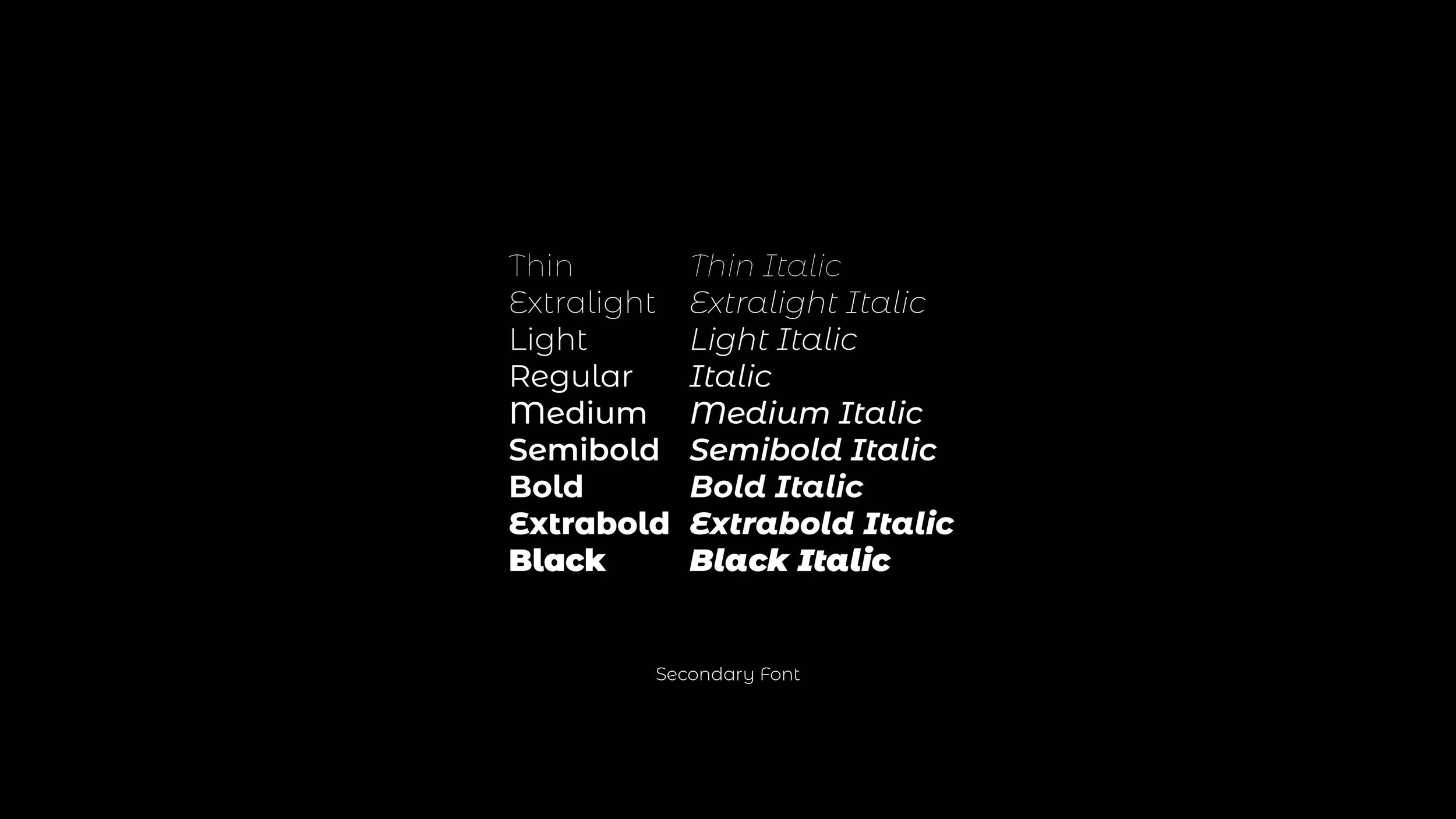
I chose the fonts Chlara, a modern ligature serif font with soft curves and Montserrat Alternate, which complement each other and echo haircare, beauty and cosmetics, aligning with the product's audience. In addition, a floral pattern adds depth to the design, providing a subtle yet effective way to elevate the small packaging surfaces, and can be used as a repeatable pattern across Crecedor's print and digital marketing.