
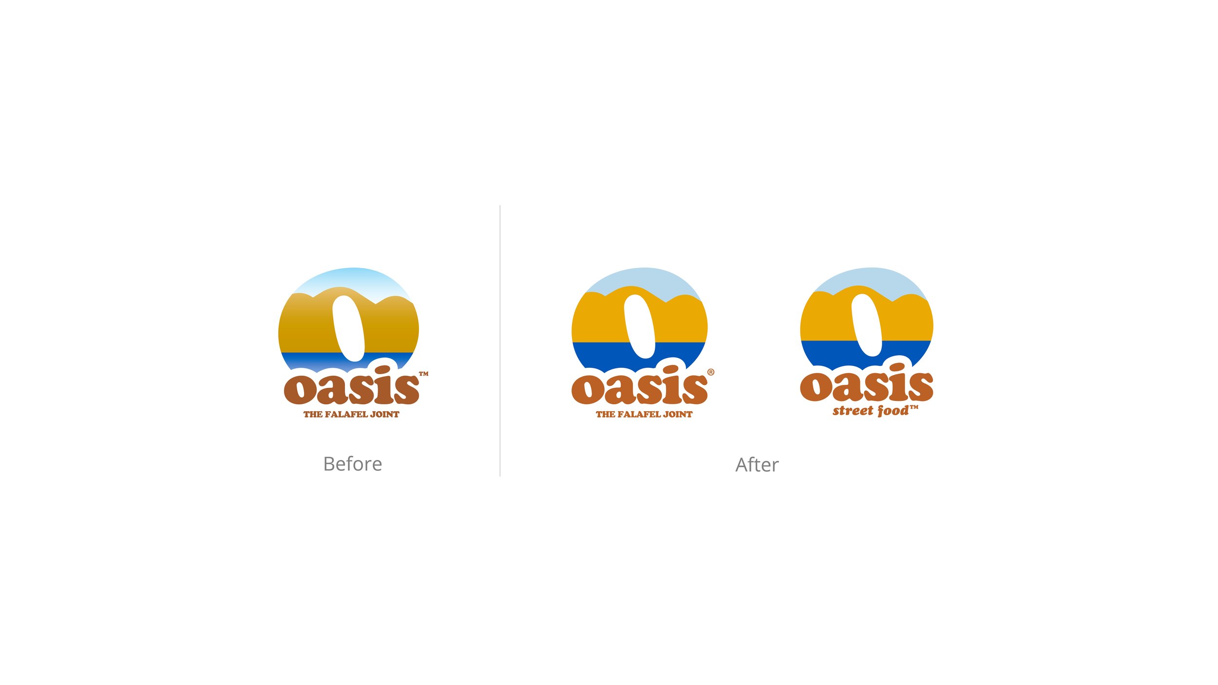
Oasis brand refresh expands the local brand into grocery stores and emerging markets
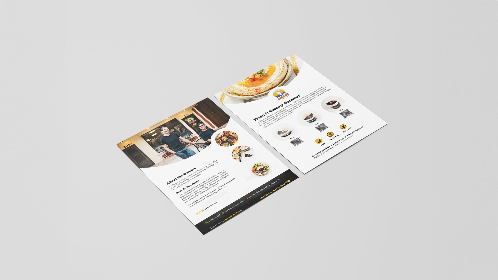
Oasis Falafel Joint is a beloved restaurant in the heart of Iowa City. Owners Ofer and Naftaly’s passion for Mediterranean food was growing beyond the restaurant. To get the product to more superfans, Oasis pursued expanding into grocery stores. To distinguish the restaurant from retail, we pitched a new name, Oasis Street Food, honoring the roots of a food cart and the mobility of eating hummus on the go.
The retro logo design was classic and instead of changing the logo, I increased the height of the horizon line of the water, adjusted to more vibrant colors, and removed the gradients, allowing an easier production method across packaging, apparel, and other marketing materials.
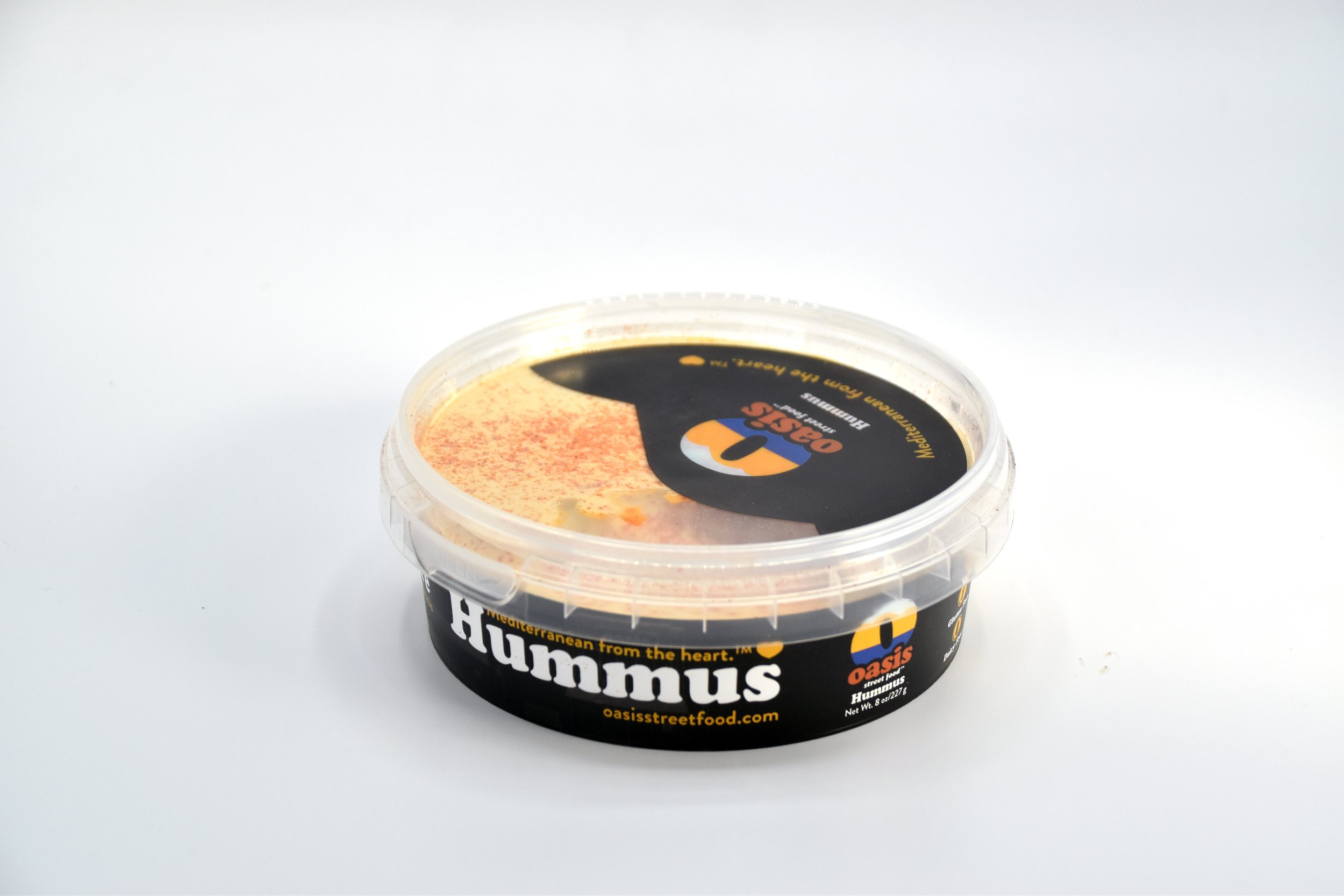
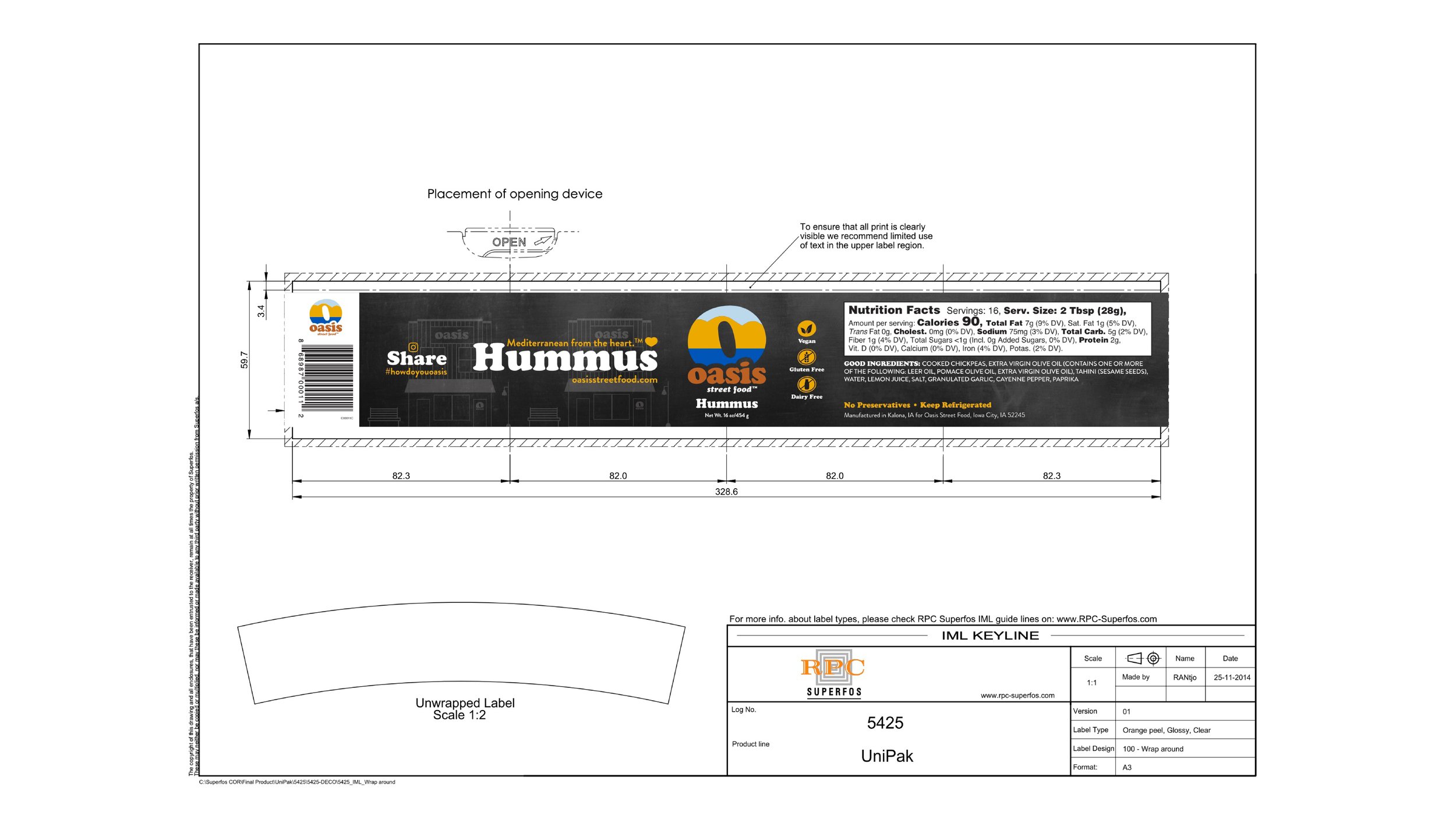
The chalkboard background was inspired by the handwritten chalkboard found in the restaurant. Cooper font remained but became much more prominent on the hummus packaging. I introduced a secondary font, Brandon Grotesque, across the packaging, creating a more distinctive information hierarchy for hungry eyes in grocery store aisles. The icons and heart were derived from the Oasis “O” shape, creating a cohesive design identity.
In 2024, Oasis recently added hummus flavors and seasoning to their product lineup. The monument grows as superfans continue to love a healthy alternative that pairs with just about anything!
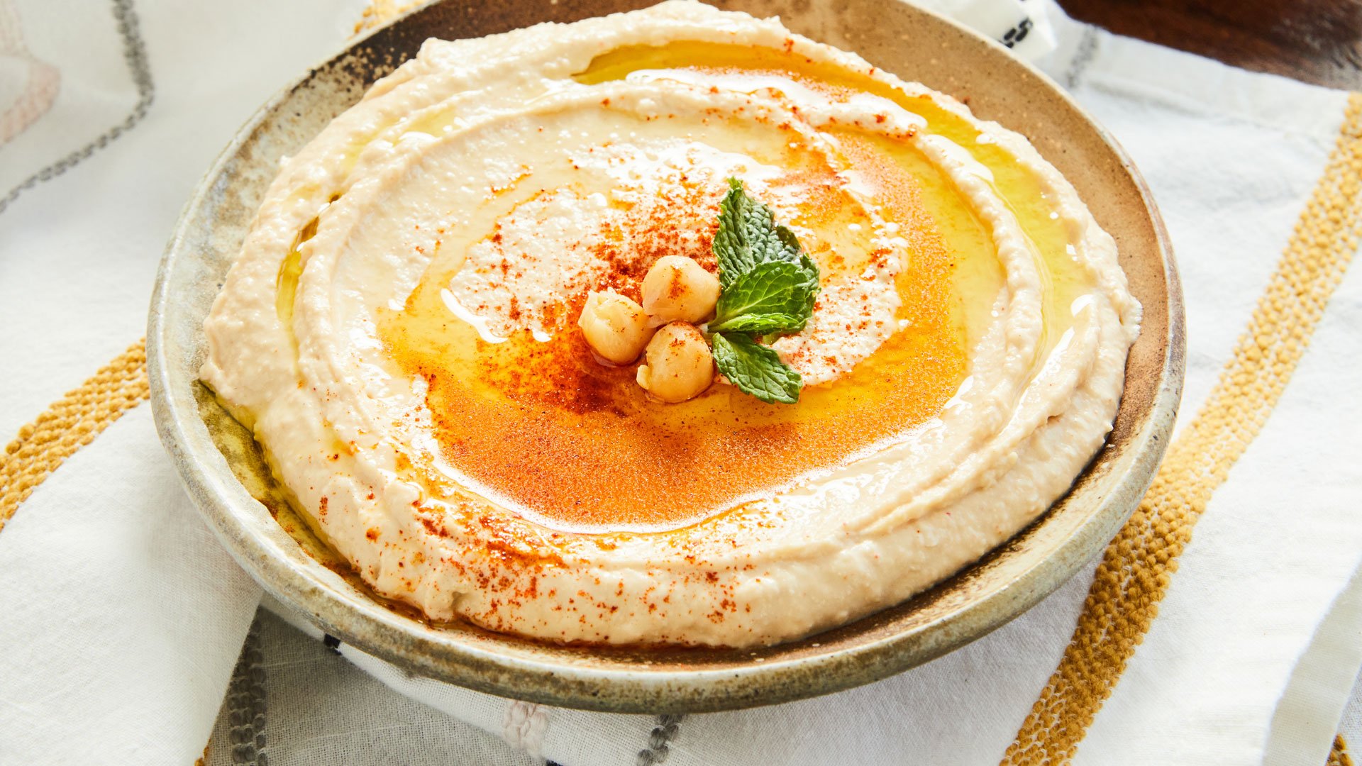
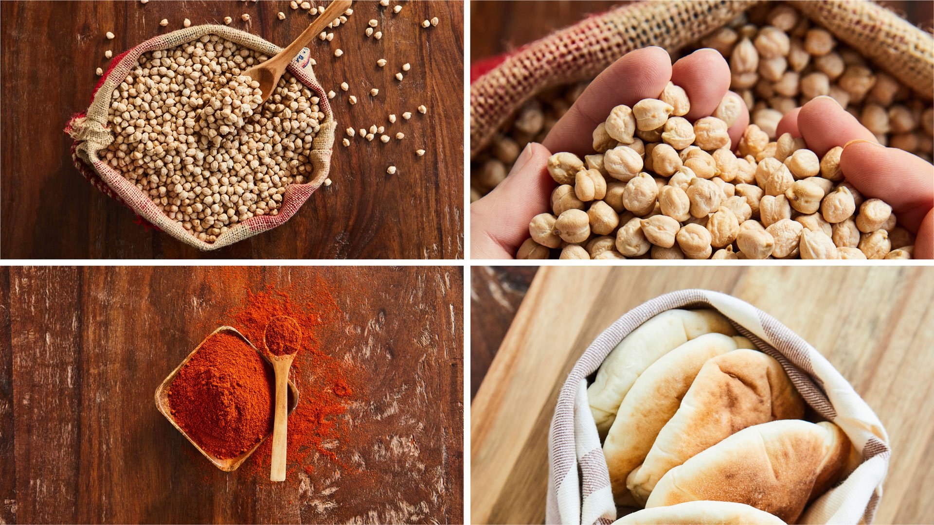
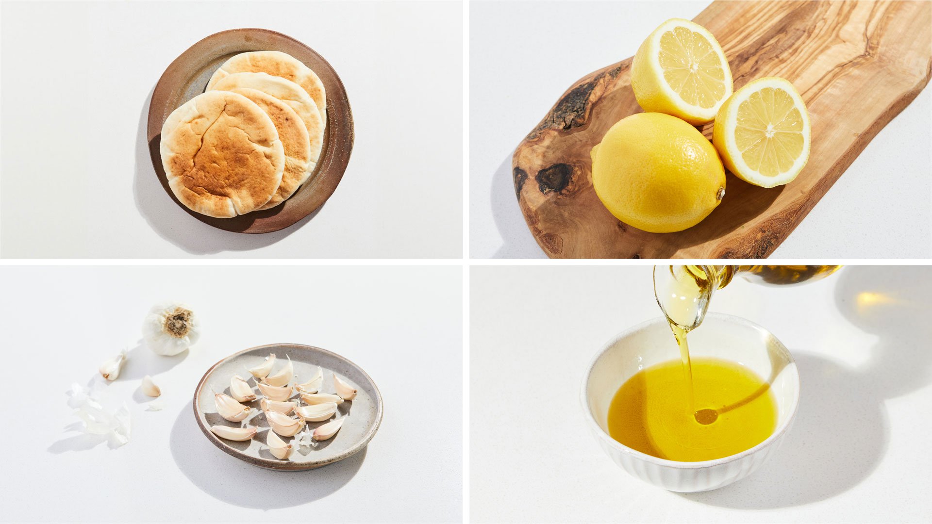
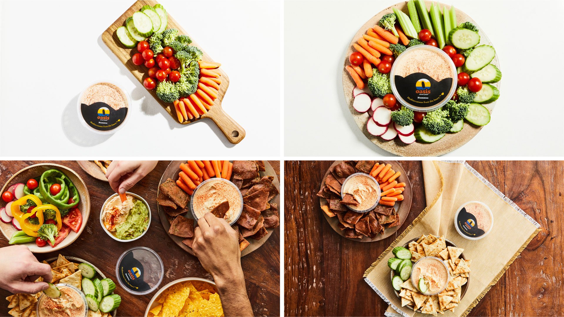
I art directed the photoshoots, including portrait sessions for PR and a food photography shoot for the website and social media channels.
Photos by Pilsen Photo Coop and Freesframephotography.
Work done as lead designer at Meld Marketing.


#howdoyouoasis
I art directed the Oasis social media campaign video #howdoyouoasis, which conveys how consumers enjoy hummus, whether a charcuterie board, homemade pita chips, or veggies. Mediterranean hummus made from the heart brings everyone together.